[ZBX-10504] Get back compact 2.x web-interface layout Created: 2016 Mar 06 Updated: 2017 May 30 Resolved: 2016 Jul 25 |
|
| Status: | Closed |
| Project: | ZABBIX BUGS AND ISSUES |
| Component/s: | Frontend (F) |
| Affects Version/s: | 3.0.0 |
| Fix Version/s: | 3.0.4rc1, 3.0.5rc1, 3.2.0alpha1 |
| Type: | Incident report | Priority: | Major |
| Reporter: | Evgenii Terechkov | Assignee: | Unassigned |
| Resolution: | Fixed | Votes: | 7 |
| Labels: | layout, regression, usability | ||
| Remaining Estimate: | Not Specified | ||
| Time Spent: | Not Specified | ||
| Original Estimate: | Not Specified | ||
| Environment: |
zabbix-3.0.1 |
||
| Attachments: |
|
| Description |
|
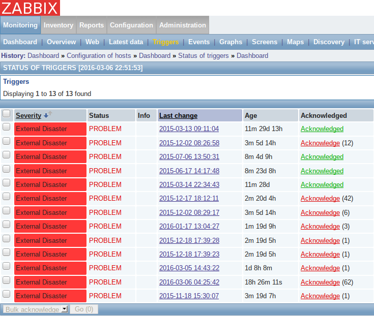
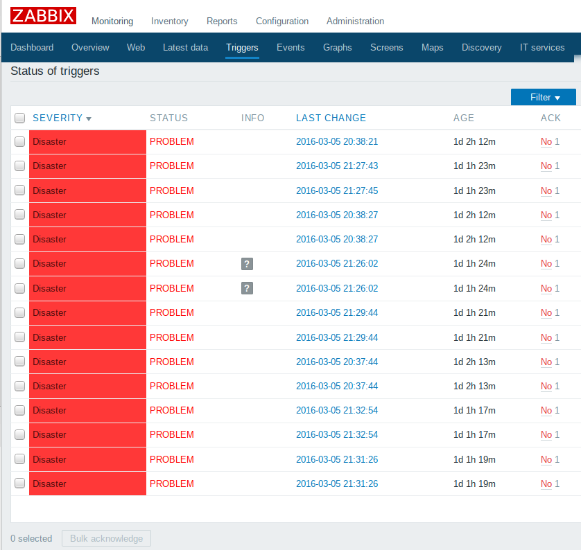
Most annoying problem with 3.x web-interface is big empty spaces around almost all elements on different pages (dashboard, triggers, ...). This is very uncomfortable for people with various screen sizes, from netbooks to wall-mounted flat panels. In zabbix-2.x, screen space usage was more effective (see attached screenshots). Please, fix this usability regression. |
| Comments |
| Comment by richlv [ 2016 Mar 06 ] |
|
looks like screenshots were forgotten ? |
| Comment by Evgenii Terechkov [ 2016 Mar 06 ] |
|
A had attached screenshots with initial description, but they mystically dissappeared |
| Comment by richlv [ 2016 Mar 06 ] |
|
i'll start by saying that 3.0 interface is no doubt more beautiful, and there are quite a lot usability improvements. that even makes functional regressions even more obvious
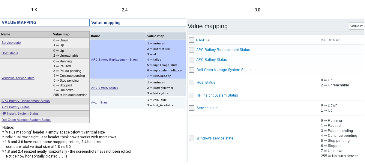
compare 1.8, 2.4 and 3.0 value mapping listing. 3.0 looks good in large size screenshots. it probably works much better when showing zabbix to people. when actually trying to work with it... it's depressing. (please note, the compound image does not claim to be beautifully laid out or even aligned much also notice how 3.0 does not scale down horizontally anymore. while that is not a concern for many, let's say you are writing an article about zabbix. you'd like the screenshots to be as small as possible, while still showing everything. this was nearly perfect in 2.4 - a lot of good work by zabbix developers ! i'll repeat that 3.0 looks beautiful - we just want to actually use it, too |
| Comment by Pavel Amosov (Inactive) [ 2016 Mar 07 ] |
|
This is a known issue and will be solved |
| Comment by richlv [ 2016 Mar 07 ] |
|
evg-krsk, could you please also clarify whether you meant only horizontal, only vertical excess spacing - or both ? |
| Comment by Evgenii Terechkov [ 2016 Mar 07 ] |
|
I meant both horizontal and vertical spacing. |
| Comment by richlv [ 2016 Mar 24 ] |
|
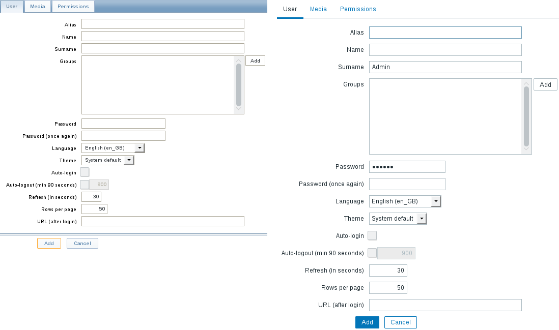
another vertical comparison - creating a new user the new form itself barely fits in my display and that's with menu and other things outside the view. |
| Comment by Pavel Amosov (Inactive) [ 2016 Mar 29 ] |
|
As a first step some issues, like tables, can be easily fixed. Forms are not so easy. |
| Comment by Pavel Amosov (Inactive) [ 2016 Mar 29 ] |
|
The issue is present due to an increased font and element size across the whole UI. The simplest solution for now is to decrease vertical padding in tables. A more sophisticated approach should be pursued in order to cater the front-end for multiple screen sizes and input methods like touch. |
| Comment by richlv [ 2016 Apr 04 ] |
|
reducing vertical padding would be great. i don't think font size increase contributed much, it was mostly excessive padding + arbitrary minimum width, maybe some other things. getting the frontend to scale like 2.4 did would do a lot to make it more usable on smaller screens. i recall how much of an improvement it was over 1.8 |
| Comment by richlv [ 2016 Apr 04 ] |
|
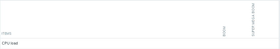
and here's an example of a very significant regression in horizontal size. overview has gained some unreasonable min width for the name column, and even individual data columns have this crazy min width, padding or whatnot - this is absolutely the most narrow what the overview can get now, and that's with two hosts displayed only. |
| Comment by Pavel Amosov (Inactive) [ 2016 Apr 04 ] |
|
Decreasing vertical padding is just the first step, no worries |
| Comment by richlv [ 2016 Apr 04 ] |
|
to possibly make it easier to improve this aspect, tracking arbitrary minimum width limit in ZBX-10612 - this issue to stay for all the other screen space bloat |
| Comment by richlv [ 2016 May 13 ] |
|
|
| Comment by Aleksandrs Saveljevs [ 2016 May 25 ] |
|
The current work in svn://svn.zabbix.com/branches/dev/ZBX-10504 development branch seems to deal with the top navigation bar and tables, but does not seem to deal with forms. Will those be handled here at a later time or in a separate issue? |
| Comment by Aleksandrs Saveljevs [ 2016 May 25 ] |
|
Padding in tables and the top navigation bar reduced in pre-3.0.4rc1 r60306 and pre-3.1.0 (trunk) r60307. These commits also have the additional benefit of adding compression to the generated CSS files (styles/blue-theme.css and styles/dark-theme.css) for a reduction in size from around 99K to about 56K. |
| Comment by Pavel Amosov (Inactive) [ 2016 May 31 ] |
|
(1) Incorrect padding in tabular navigation. See Configuration-->Hosts PavelA RESOLVED in r60419 asaveljevs r60419 contains the following diff: Index: sass/stylesheets/sass/screen.scss
===================================================================
--- sass/stylesheets/sass/screen.scss (revision 60418)
+++ sass/stylesheets/sass/screen.scss (revision 60419)
@@ -587,6 +587,7 @@
.list-table {
width: 100%;
background-color: $ui-bg-color;
+ border-collapse: separate;
border: 1px solid $ui-border-color;
thead th {
@@ -2001,7 +2002,7 @@
&.ui-tabs-active {
a {
- padding: 8px 13px 6px 13px;
+ padding: 8px 10px 6px 10px;
background-color: $transparent;
color: $font-color;
text-decoration: none;
The padding fix looks good, but the border fix does not seem to be related. Was the border change intentional or is it just a carryover from (the currently unfinished) PavelA Seems like a carryover asaveljevs Then I just merge the padding fix, leaving the border change for asaveljevs Merged in pre-3.0.4rc1 r60429 and pre-3.1.0 (trunk) r60430. CLOSED. |
| Comment by Alexander Vladishev [ 2016 Jul 15 ] |
|
(2) Broken graph width
asaveljevs RESOLVED in r61084 in development branch svn://svn.zabbix.com/branches/dev/ZBX-10504 by reducing padding for graphs that is set in JavaScript. sasha CLOSED asaveljevs Merged in pre-3.0.5rc1 r61205 and pre-3.1.0 (trunk) r61206. |
| Comment by Ronny Pettersen [ 2016 Jul 20 ] |
|
I don't know if this have been added already, but this fixes the table padding as seen in the dashboard screenshot (and others where this css table element is used):
--- share/web.org/styles/blue-theme.css 2016-05-18 14:59:37.000000000 +0200
+++ share/web/styles/blue-theme.css     2016-07-20 10:47:06.954501887 +0200
@@ -447,7 +447,7 @@
     .list-table tbody tr:last-child td {
       border-bottom: none; }
   .list-table td {
-    padding: 8px 5px;
+    padding: 3px 2px;
     vertical-align: middle;
     border-bottom: 1px solid #ebeef0; }
   .list-table .vertical_rotation_inner {
diff -ur share/web.org/styles/dark-theme.css share/web/styles/dark-theme.css
--- share/web.org/styles/dark-theme.css 2016-05-18 14:59:37.000000000 +0200
+++ share/web/styles/dark-theme.css     2016-07-20 10:46:33.757155427 +0200
@@ -462,7 +462,7 @@
     .list-table tbody tr:last-child td {
       border-bottom: none; }
   .list-table td {
-    padding: 8px 5px;
+    padding: 3px 2px;
     vertical-align: middle;
     border-bottom: 1px solid #383838; }
   .list-table .vertical_rotation_inner {
Padding "3px 2px" looks satisfactory for me, but could perhaps be decreased even more. |
| Comment by Aleksandrs Saveljevs [ 2016 Oct 11 ] |
|
The added CSS compression introduced a problem with Debian packaging - see |
| Comment by richlv [ 2016 Oct 17 ] |
|
this improved the situation, but didn't get back to the more compact view still - a css at ZBXNEXT-3502 goes further ZBXNEXT-3504 asks for upstream integration of the 3502 changes |