-
Type:
Incident report
-
Resolution: Fixed
-
Priority:
Major
-
Affects Version/s: 3.0.0
-
Component/s: Frontend (F)
Let's say that it's possible to place widgets to 3 columns - left, middle right ones.
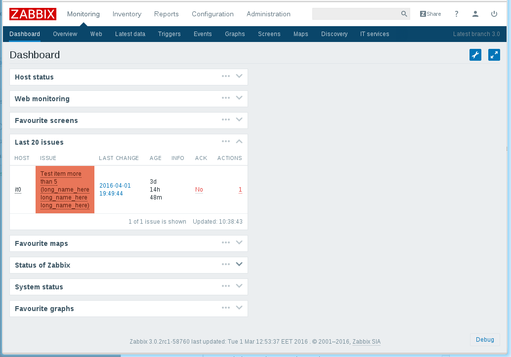
Take a look to attached screenshot.
Here I placed all widgets to the single middle column:

Note how a huge space on left is reserved and not used to expand widgets.
Such behavior forces long trigger names to be wrapped to multi lines and as result generated page takes several times more space that it could.
Yes, I can move all widgets to the left column, but still middle and right columns will reserve their own place together and will not allow to expand widgets:

Even if place widgets to 2 columns (which, I believe, most of frontend users are using), there is still reserved reserved space for 3rd column.
Such behavior was actual before 3.0, but in 3.0 it gets more critical because frontend layout takes more space now, increased fonts size etc.
I think that the reserved space should be reduced as much as possible, while still providing a hint that there are places <- | -> to move widgets if they are placed to a single/two column(s).
Such fix should also resolve forced extra horizontal scrolling in browser on dashboard page, when it really should not appear.
- is duplicated by
-
ZBX-11232 dashboard columns not using available space
-
- Closed
-

