-
Type:
Sub-task
-
Resolution: Duplicate
-
Priority:
 Blocker
-
None
-
Affects Version/s: 1.9.0 (alpha)
-
Component/s: Frontend (F)
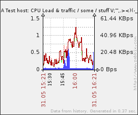
trunk graphs are very nice, but there are some layout and formatting issues. lumped in single report for now.
1. in the graphs-trunk, notice how graph title fontsize differs for these two graphs from the same screen (ZBX-3400 seems to be about the same issue)
<richlv> this seems to be fixed in ZBX-3400, CLOSED
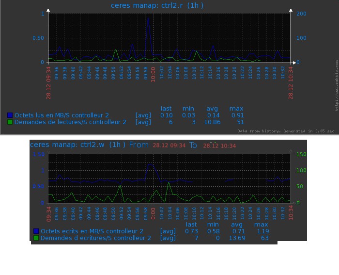
2. in the graphs-trunk, notice how the two graphs are not the same height. actually, they are configured to have identical height. apparently, height is used for graph data plotting area, not whole area. it makes neatly laid out screen configuration very hard - and even completely impossible as trigger can be visible on the graph and it can be missing. instead, graph size should specify outer border and graph plot area should be scaled to that.
<richlv> split out as ZBX-6632, CLOSED
3. graphs-trunk. in the second graph notice how "Last" and "Min" legend text has larger font than legend text itself. fontsize of these elements should be identical
<richlv> seems to be fixed in trunk r35919, CLOSED
4. graphs-trunk. in the first graph, notice how graph title is not aligned in the middle of the graph area.
<richlv> couldn't reproduce in trunk r35919 anymore, CLOSED
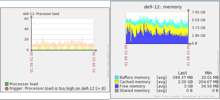
5. graphs-trunk. in both graphs, notice how there's much room on the left and to the right that is wasted. instead graph should flow from one side to another as tightly as possible, taking into account y axis legend on both sides. compare this to graphs-1.6 (although there graphs also could expand more to the right).
still there in trunk r36016.
see https://support.zabbix.com/secure/attachment/22718/y_axis_label_space.png for an example of the current situation
asaveljevs It seems we can consider this as a duplicate of ZBX-6181. CLOSED.
6. graphs-trunk. in the first graph, notice how legend covers "Data from trends. generated in n sec"
<richlv> this seems to be fixed in trunk r35919, CLOSED
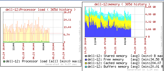
7. graphs-trunk. on both graphs, notice the uselessness of x axis labels. these graphs have yearly scale. as such, legend should include year, but on the other hand, it should also take up less space. maybe do not print time, but add year instead ? labels would still take too much space vertically, so for that some better solution might be needed
<richlv> split out as ZBXNEXT-1762 , CLOSED
8. graphs-trunk. on both graphs, notice how there are no x axis legends inbetween start and end points. in this scale/size a couple more legend entries would be useful (compare to graphs-1.6, although there useless time labels are printed)
<richlv> seems to be fixed in trunk r36016, CLOSED
if needed, these could be split out in separate issues. also, most can wait for 1.8.1 or so...
- duplicates
-
ZBXNEXT-1762 show year on x axis labels
-
- Closed
-
-
ZBX-3400 different font sizes for graph headers in screens
-
- Closed
-
-
-

- Closed
-
-
-
- Closed
-