Uploaded image for project: 'ZABBIX BUGS AND ISSUES'
  1. ZABBIX BUGS AND ISSUES
  2. ZBX-13303

"Use if severity" is very hard to read

XMLWordPrintable

    • Team B
    • Sprint 26, Sprint 27, Sprint 28, Sprint 29
    • 1

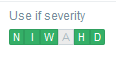
      This actually affects pretty much every version of Zabbix, I guess. Even if you are not colour-blind, the contrast is very thin between the green and grey of the thin font in which the severities are written in.

      Somewhat related to https://support.zabbix.com/browse/ZBX-10561

        1. media_use.png
          media_use.png
          2 kB
        2. no-border.png
          no-border.png
          7 kB
        3. borders-dark.png
          borders-dark.png
          5 kB
        4. borders-blue.png
          borders-blue.png
          5 kB
        5. borders-hc-light.png
          borders-hc-light.png
          6 kB
        6. borders-hc-dark.png
          borders-hc-dark.png
          5 kB

            sasha Alexander Vladishev
            volter Volker Fröhlich
            Team B
            Votes:
            0 Vote for this issue
            Watchers:
            6 Start watching this issue

              Created:
              Updated:
              Resolved: