-
Type:
Problem report
-
Resolution: Fixed
-
Priority:
Trivial
-
Affects Version/s: 6.0.2, 6.2.0alpha1
-
Component/s: Frontend (F)
-
None
-
Sprint 90 (Jul 2022)
-
1
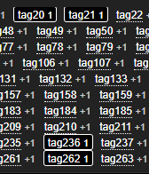
In Item configuration list and latest data/graph subfilters, having multiple active items selected, they are overlapping each other.
The proposal is to increase the vertical margin between elements while decreasing the padding within the element.
This is how it looks now:
This is how it might look like fixed:


