-
Type:
Problem report
-
Resolution: Duplicate
-
Priority:
Trivial
-
None
-
Affects Version/s: 5.0.32, 6.0.14, 6.4.0, 7.0.0alpha1
-
Component/s: Frontend (F)
Description
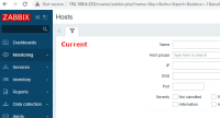
While testing filters I noticed that the funnel icon looks slightly off-center and too close to the top of the tab. While investigation further I also noticed that when this same icon is displayed on a button (inactive tab) it is positioned differently and looks better.
Suggestion
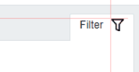
Move the funnel icon 1px to the left and 1px lower when displayed on a tab.
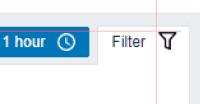
Single icon preview:
How switching a tab looks currently:
Switching a tab after the changes would look like this:
Affected areas
Seems that whenever this icon is on a tab it is displaced. This happens on all 4 themes.
- part of
-
ZBXNEXT-8515 Switch frontend icons to fonts
-
- Closed
-


