-
Type:
Problem report
-
Resolution: Unresolved
-
Priority:
Major
-
None
-
Affects Version/s: 7.0.0rc1
-
Component/s: Frontend (F)
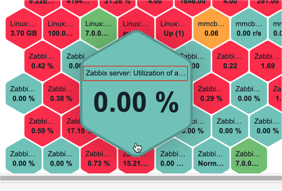
The current implementation of honeycomb widget is visually awesome, but has the following disadvantages when a cell is selected:
- the hexagonal shape which appears is not suitable to accommodate long strings: items names and values are often truncated, making the widget not so useful. Displaying mouseover details into a rectangular shape would be a more effective solution (while not as cool as hexagons).

- at certain zoom levels, the focused cell completely hides all the adjacent cells, making very difficult to move the mouse from the current cell to the very next one. The details shape should be offset from the mouse pointer.
[^ selecting adjacent cells.mov]
- the popup animation adds unneeded delay when searching the cells. Removing the animation effect delay would make the widget to appear faster and more responsive.
- depends on
-
ZBX-25242 Clicking 'zoom in' 2 times removes all data from Honeycomb widget
-
- Closed
-