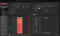
Create hosts, items, triggers and generate some problems. Mark some problems as cause so that the first column with checkbox is wider than usual. Shrink the size to about 1400px wide. That I think was the bare minimum where after anything below the width of the middle portion remains the same and if screen is wider it starts to stretch.
Go to Monitoring->Problems and enable "Compact view".
First of all the filter is wider and goes outside of boundaries. So to avoid any other anomalies, resize the browser to about 1415px in width.
In this case words "Host" and "Problem" are clearly visible in 6.0, but starting from 6.4+ they are cut off. Sometimes table headings will have "H...", "Pro..." and sometimes not even with "...", just letters cut off completely. But at the same time space reserved for tags is huge.
There should be at least some minimum width for host and problem columns, at least in default English. I know that there are languages that will not fit there always. And perhaps tags column should be more dynamic. As you can see in the attached image, there is plenty of space left.
