-
Type:
Problem report
-
Resolution: Unresolved
-
Priority:
 Trivial
-
None
-
Affects Version/s: None
-
Component/s: None
-
None
Problem:
Various Zabbix themes are affected by text and UI component color contrast problems, which should be addressed to comply with accessibility requirements.
Solution:
As part of Zabbix design system establishment, an accessible and scalable color system should be created with color usage guidelines and design tokens.
Blue theme
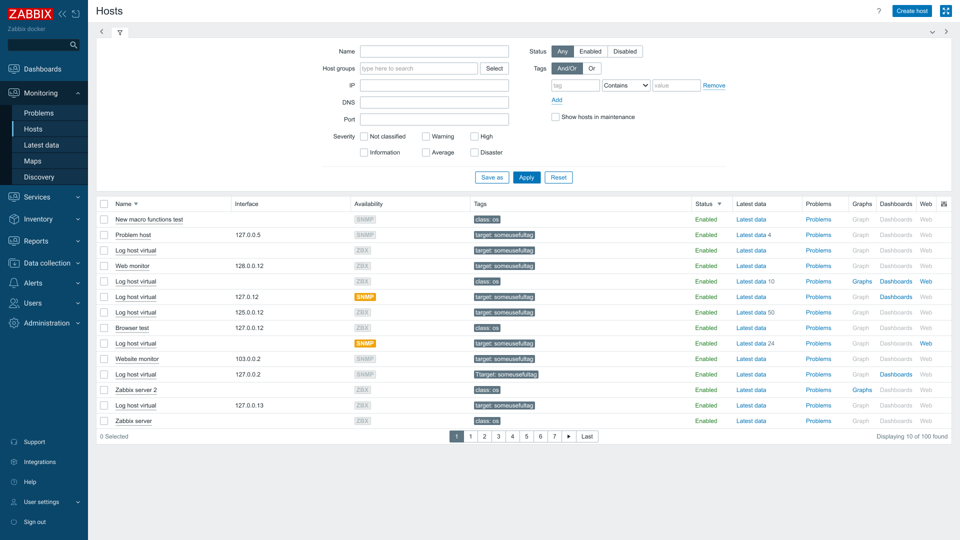
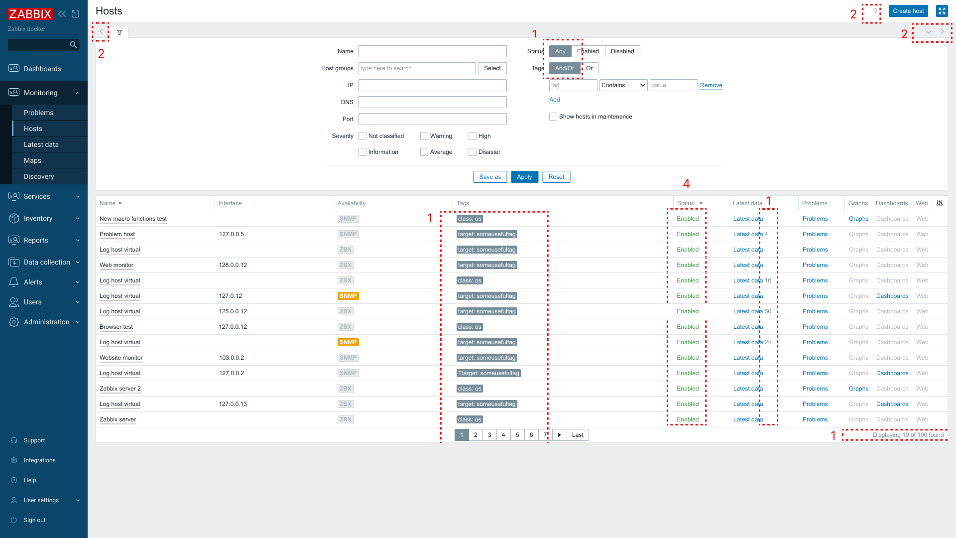
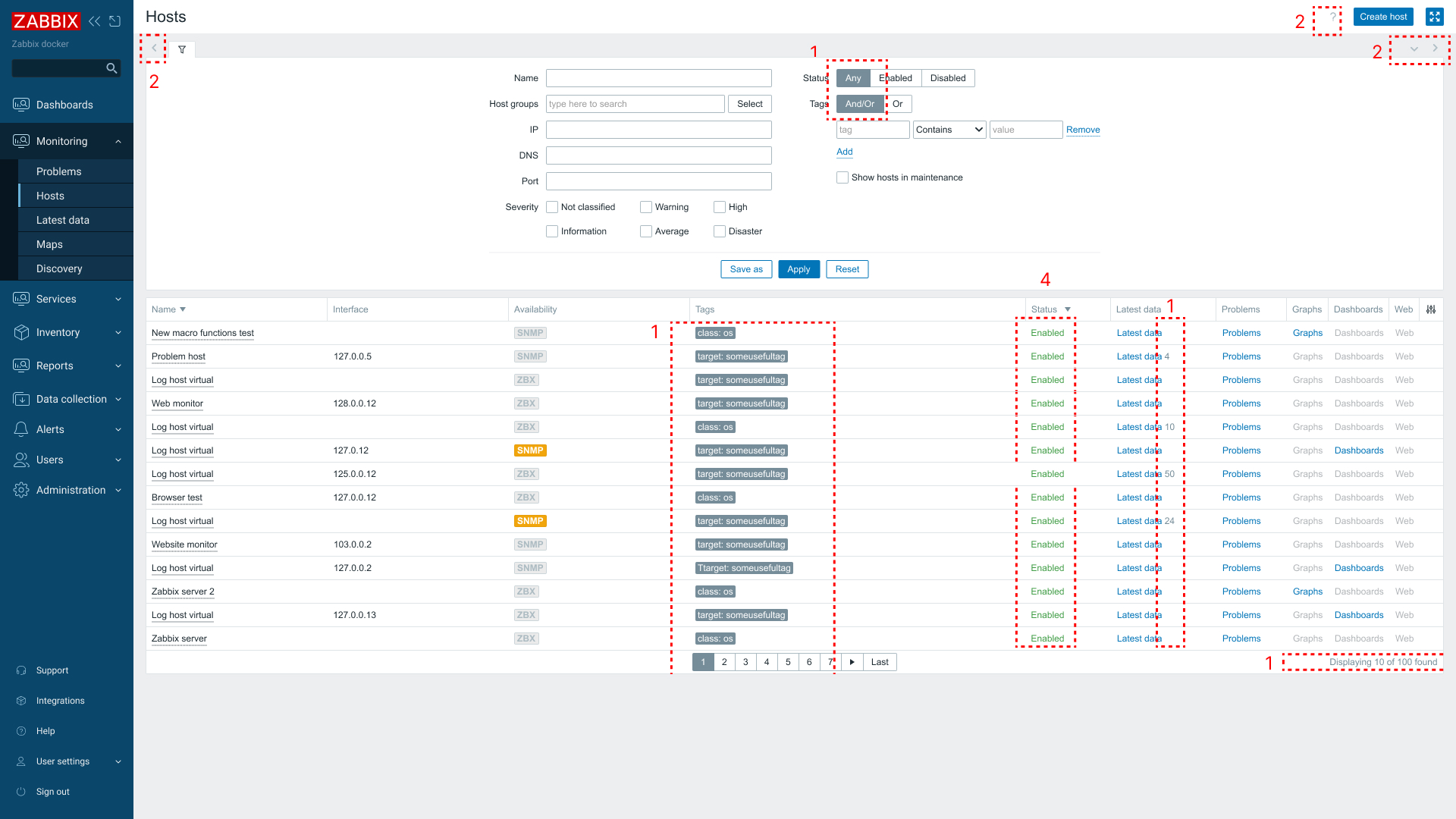
- The current color #768D99 used for components and text fails to meet minimum accessibility contrast requirements.
- Icons using background color #B0BEC5 do not provide sufficient contrast against white backgrounds.
- The green color elements with value #429E47 (green, .green.btn-icon:not([disabled]), .green.btn-link:not([disabled]), .green.link-action:not(:hover):not(:focus), .green.link-alt:not(:hover):not(:focus)) also fails color contrast requirements.
- The red color elements with value #e33734 (.color-negative, .color-negative.btn-icon:not([disabled]), .color-negative.btn-link:not([disabled]), .color-negative.link-action:not(:hover):not(:focus), .color-negative.link-alt:not(:hover):not(:focus), .red, .red.btn-icon:not([disabled]), .red.btn-link:not([disabled]), .red.link-action:not(:hover):not(:focus), .red.link-alt:not(:hover):not(:focus)) do not meet color contrast requirements.
Blue theme UI before (with problems):
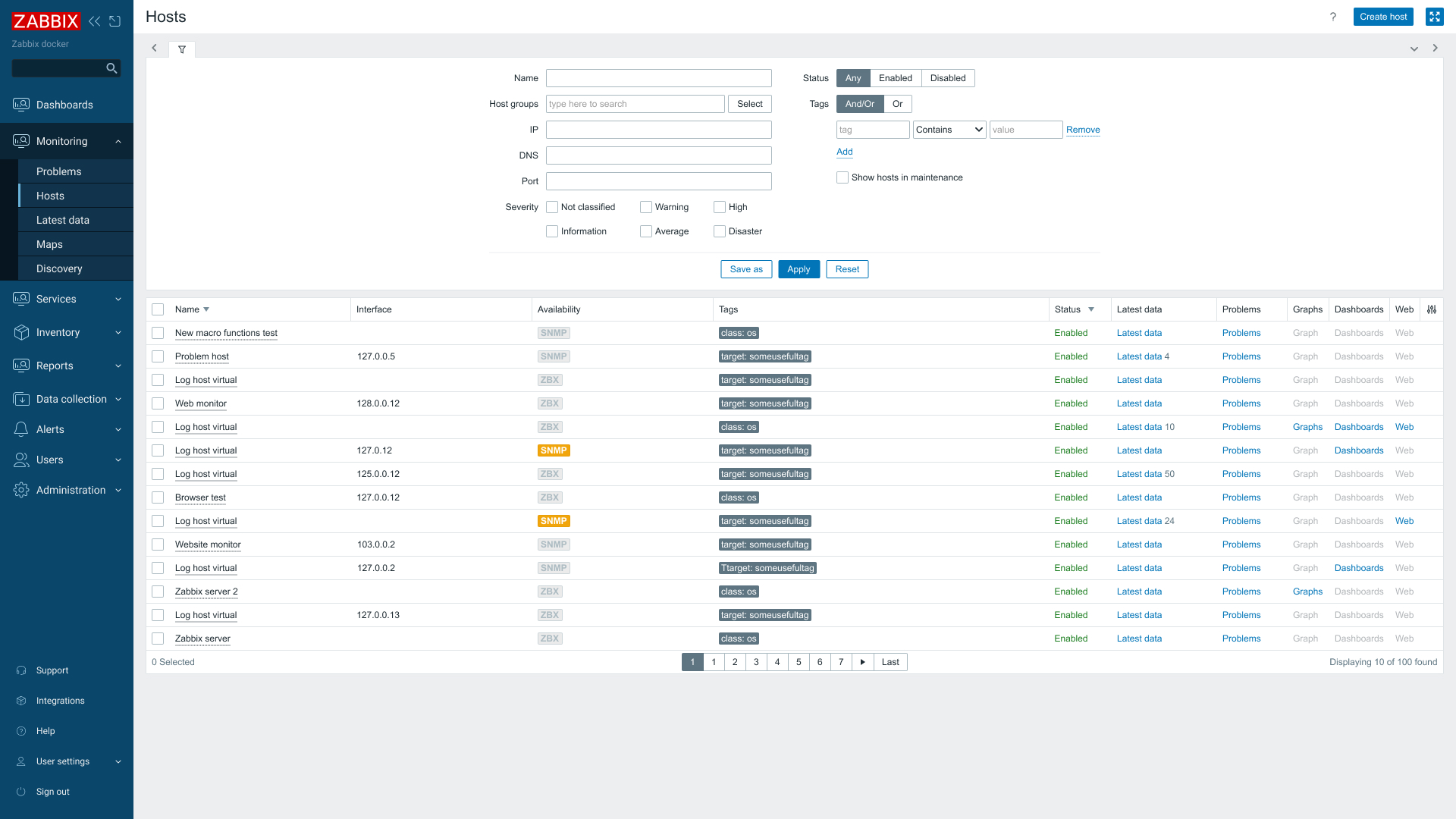
Updated Blue theme after:
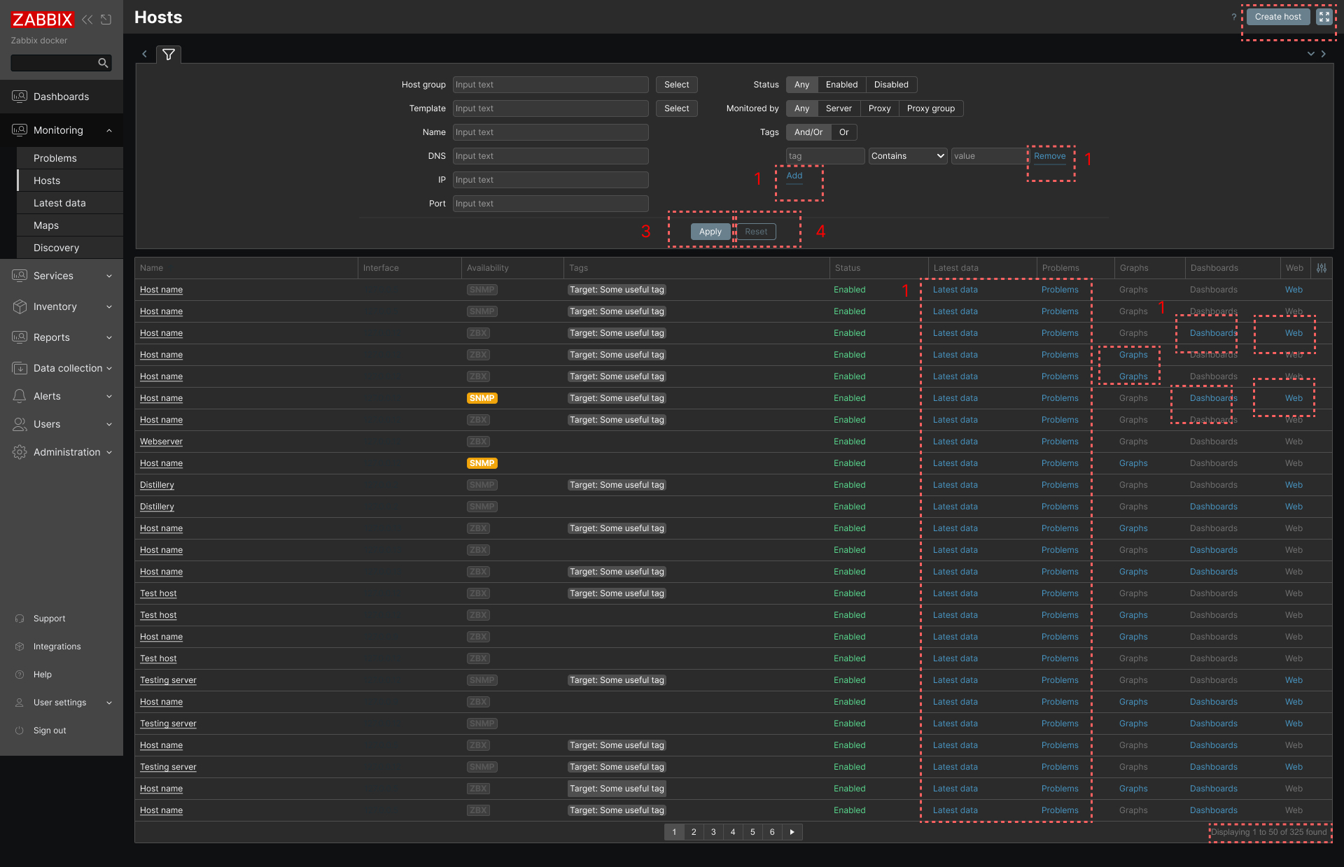
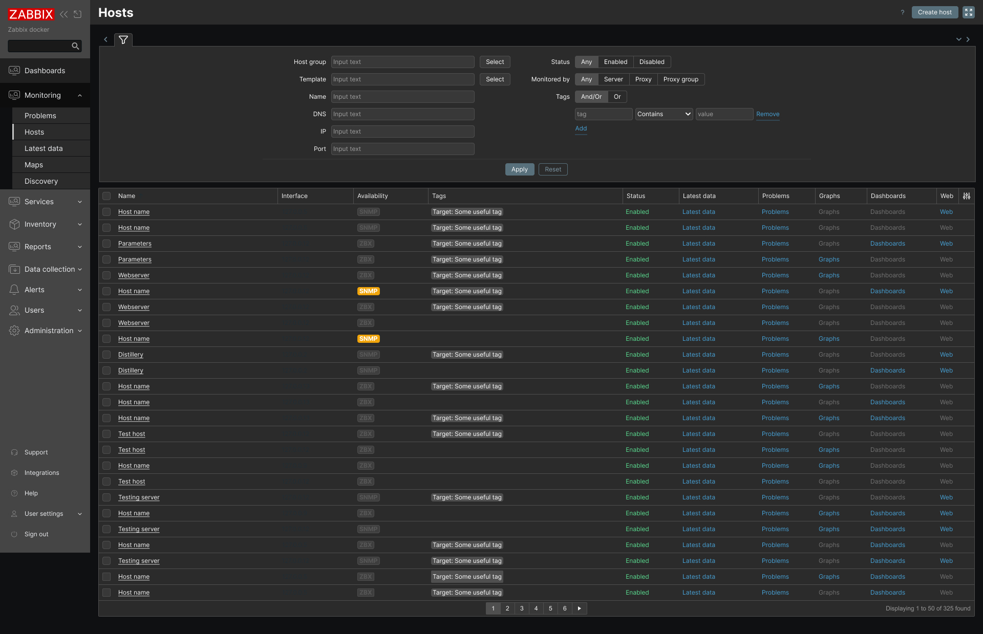
Dark theme
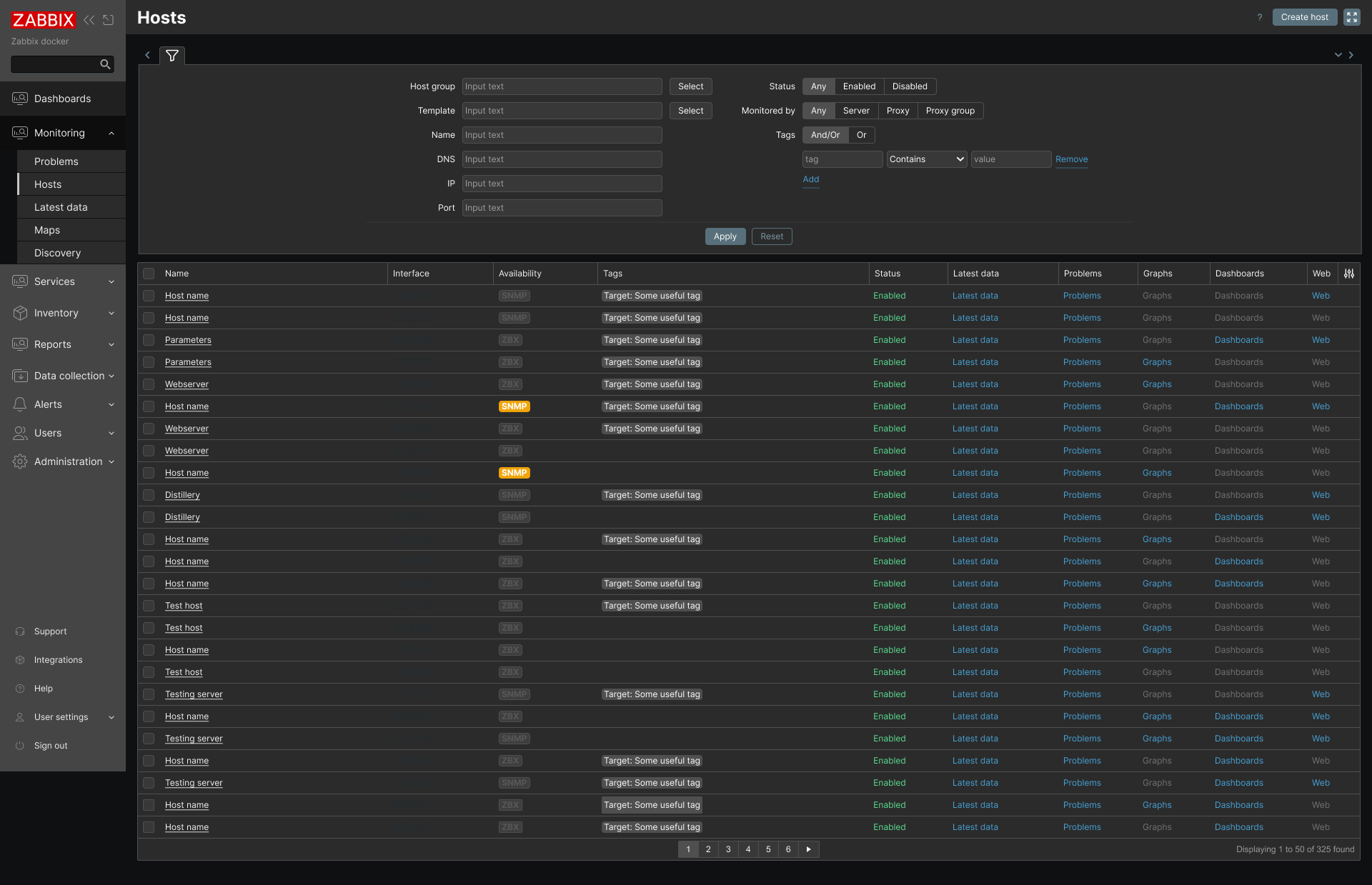
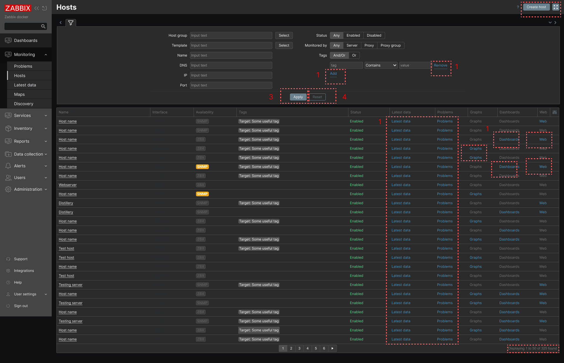
- Links and link buttons with value #4796C4 do not meet minimum color contrast requirements.
- Solid action buttons do no meet color contrast requirements. It is recommended to change existing bg/border = #69808D
- Outline action buttons do no meet color contrast requirements. It is recommended to change existing border color = #69808D
- Text and link buttons with color #737373 do not meet color contrast requirements.
Dark theme before:
Dark theme after:
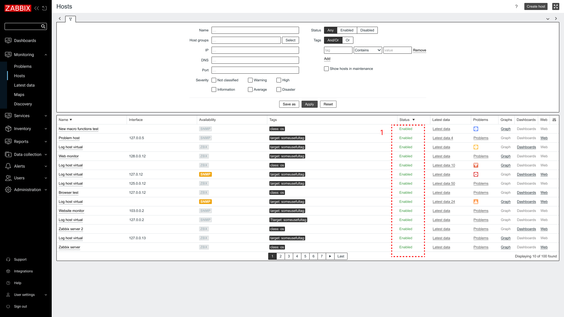
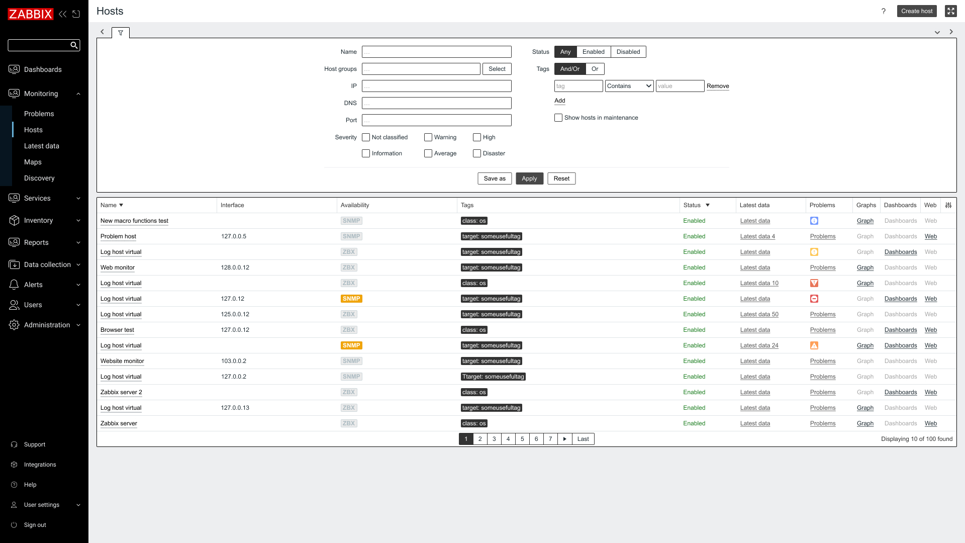
High-contrast light
- The green color elements with value #009900 (.green, .green.btn-icon:not([disabled]), .green.btn-link:not([disabled]), .green.link-action:not(:hover):not(:focus), .green.link-alt:not(:hover):not(:focus), .color-positive, .color-positive.btn-icon:not([disabled]), .color-positive.btn-link:not([disabled]), .color-positive.link-action:not(:hover):not(:focus), .color-positive.link-alt:not(:hover):not(:focus)) fails color contrast requirements.
High-contrast light before:
High-contrast light after:
Expected result:
Improved readability and accessibility.
Benefits:
Improving color contrast will make the product easier to read and navigate for everyone, supporting users with low vision or color blindness, and ultimately increasing usability and trust in the platform.