-
Type:
Incident report
-
Resolution: Fixed
-
Priority:
Major
-
Affects Version/s: 1.9.2 (alpha)
-
Component/s: Frontend (F)
-
None
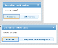
After merge ZBXNEXT-592 we see the nice confirmation dialog for scripts, but see to picture.
In this picture collected confirmation dialog in 5 different browsers and in two languages - Germany and Ukrainian.
Yes, only in Ukrainian the single word "Cancel" are translated as long phrase "????????? ?? ???????????"
It has a special meaning, please do not blame me for it ![]()
The main point is that the Cancel button should be the most extensive and well distinguishable from the others buttons - we can click it intuitively. It's like the difference between Ok and Cancel (see bottom on the picture).
I even like to suggest you replace "Cancel" button to "Cancel and return" button. That is offer - think about it.
But even see to Germany....
I'm sure you can improve the layout of the confirmation dialog so that the text on the long button appears normal and the buttons were in a single line.


