-
Type:
Incident report
-
Resolution: Fixed
-
Priority:
Major
-
Affects Version/s: None
-
Component/s: Frontend (F)
-
None
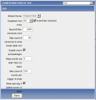
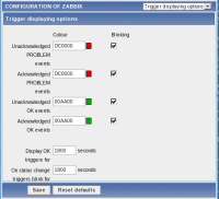
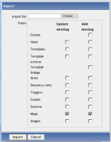
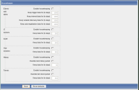
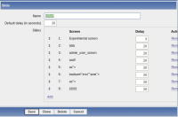
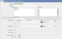
ever since 2.0 redesign, most forms have become rather terrible at smaller width - layout and wrapping is illogical.
this is extremely evident in two cases :
- demonstrating zabbix and zooming in;
- creating screenshots for documentation and other purposes
as these leave bad impression, it would be highly appreciated to fix this... well, that, and this being at the top or very close to it in my personal "most annoying bugs" list ![]()
