-
Type:
New Feature Request
-
Resolution: Unresolved
-
Priority:
 Trivial
-
None
-
Affects Version/s: 7.0.17, 7.2.11, 7.4.1
-
Component/s: Frontend (F)
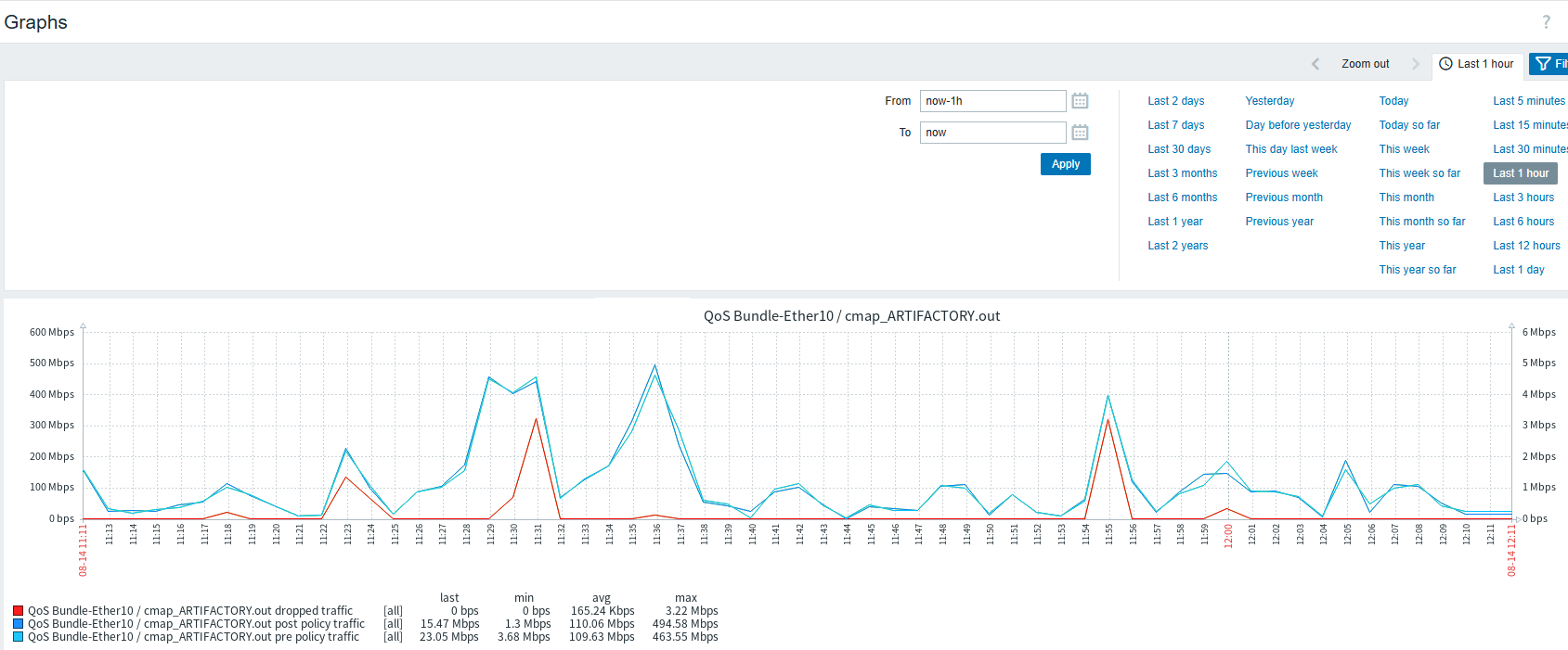
There are cases when a user can choose different scale for different set of data to appear on right Y axis, but there is no option currently to add labels to axis. For a user, it can take a while to understand what is happening on the graph.
So this feature request is a suggestion to add optional labels to Y axis for clarity.
Example graph in attachments.