-
Type:
Change Request
-
Resolution: Unresolved
-
Priority:
Major
-
None
-
Affects Version/s: None
-
Component/s: Frontend (F)
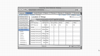
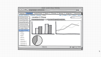
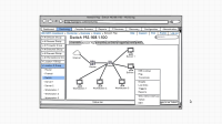
I would like to propose an improvement to the way how a user navigates Zabbix web interface by
adding some new views and controls to Zabbix frontend.
1. The main menu, situated on the top of the page should keep its current place.
2. A multi-tab view should replace the current main menu sub-items and the current main part of the page.
3. A navigation tree, containing hosts and host groups, should be added to the left side of the page.
With this improvement any type of monitoring data will be accessible with at most 3 clicks of a mouse button.
Please also see the attached pictures.
This interface improvement was inspired by Adrem NetCrunch
http://www.adremsoft.com/netcrunch/screens/ - a commercial monitoring software, which I had an occasion
to use. Navigating through its user interface seems very intuitive for me and other users, who tried both
Zabbix and NetCrunch.
- is duplicated by
-
ZBXNEXT-2481 left side menue
-
- Closed
-


