-
Type:
Change Request
-
Resolution: Unresolved
-
Priority:
Trivial
-
None
-
Affects Version/s: None
-
Component/s: Frontend (F)
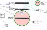
Hi, please consider changing maps' icons problem highlighting from Circle to Rectangle, just as you ve done for 'maintenance' or 'disabled' status.
Because if icon is far from being square (wide 1u device icon for instance) it eats too much space on the map if in problem state.
Please see screen attached for the example:

