-
Type:
Change Request
-
Resolution: Unresolved
-
Priority:
 Minor
Minor
-
None
-
Affects Version/s: 3.2.7, 3.4.1
-
Component/s: Frontend (F)
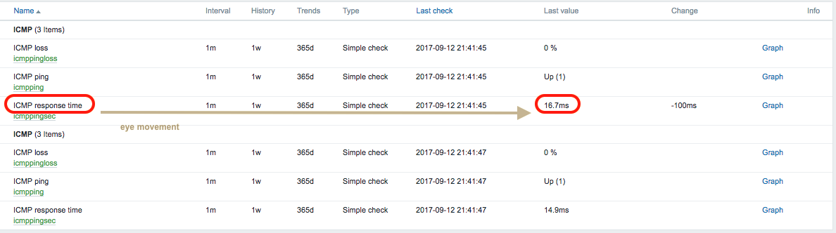
"Latest data" page should allow users to quickly see last value of items, however current table layout does not help very much:
1) Columns order: currently item name and last value are somehow distant; they could be made contiguous to avoid a lot of extra eye movements and to improve readability.
2) Table width: 100% width in css makes columns to appear even more distant, especially on large screens.
Highligthed row on mouse-over is of little help, IMHO.
PROPOSAL
1) A new column order:
[Host] [Name] [Last value] [Change] [Last check] [Interval] [History] [Trends] [Type] [Graph/history] [Info]
2) A stylesheet change to collapse columns on the left and reduce space between columns.