-
Type:
New Feature Request
-
Resolution: Unresolved
-
Priority:
 Trivial
-
None
-
Affects Version/s: 3.4.7
-
Component/s: Frontend (F)
-
None
-
Environment:Slackware on Xen server
Hi guys
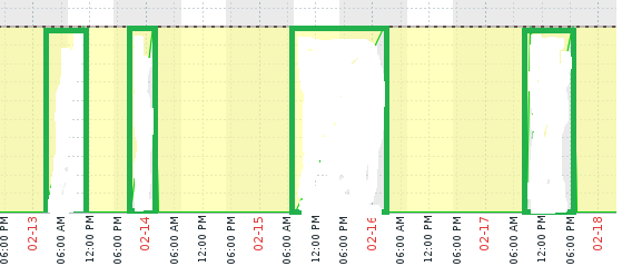
I'm using Zabbix to track a generators run time so we can see how often the it kicks in to compensate for the solar panels & batteries on cloudy days.
When the generator turns on I submit a 1 as the item value via zabbix_sender. When it turns off I submit a 0 for item value.
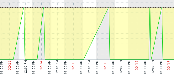
When I display this on a graph the start and stop times are correct but the graph displays slanted lines for the start time instead of a straight line which is confusing.
I would like the option to display straight up and down lines for on/off data please.
I've attached two pictures: The first being what I'm currently getting and the second being an ms-paint approximation of what I'd like to see.
Thanks all
Keep up the great work.