-
Type:
Change Request
-
Resolution: Unresolved
-
Priority:
Minor
-
None
-
Affects Version/s: None
-
Component/s: Frontend (F)
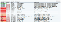
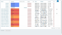
 Problem view compact mode seems to be unbalanced:
Too much width wasted by:
- Severity,
- Status,
- Actions,
while most informative Problem and Host columns can't fit.
This is especially seen on small to medium screens.
Suggestions:
1. Replace text of severity with icons or color only with text onhover or just drop this column and use row highlight only
2. Replace text in Status to small icons or drop this column altogether
3. Hide duration (*if widget width less than 800px). This is basically a duplicate of *Time. Also ** Duration can be seen in on hover anyway.
4. Limit width(margins etc) of Info column as much as possible. This is too much width wasted for small icon that rarely seen.
Recovery time. Hide Recovery time *(*if widget width less than 800px). It will be seen on hover or full screen problem view.
- mentioned in
-
Page Loading...


