-
Type:
Change Request
-
Resolution: Unresolved
-
Priority:
Minor
-
None
-
Affects Version/s: 4.0.0
-
Component/s: Frontend (F)
The actions window in PROBLEMS showing informations about ACK, MSG, EMAIL SENT, etc., should behave more responsively to the browser/display resolution.
For instance, in the list of problems like below, where one gets e.g. "22" related actions:

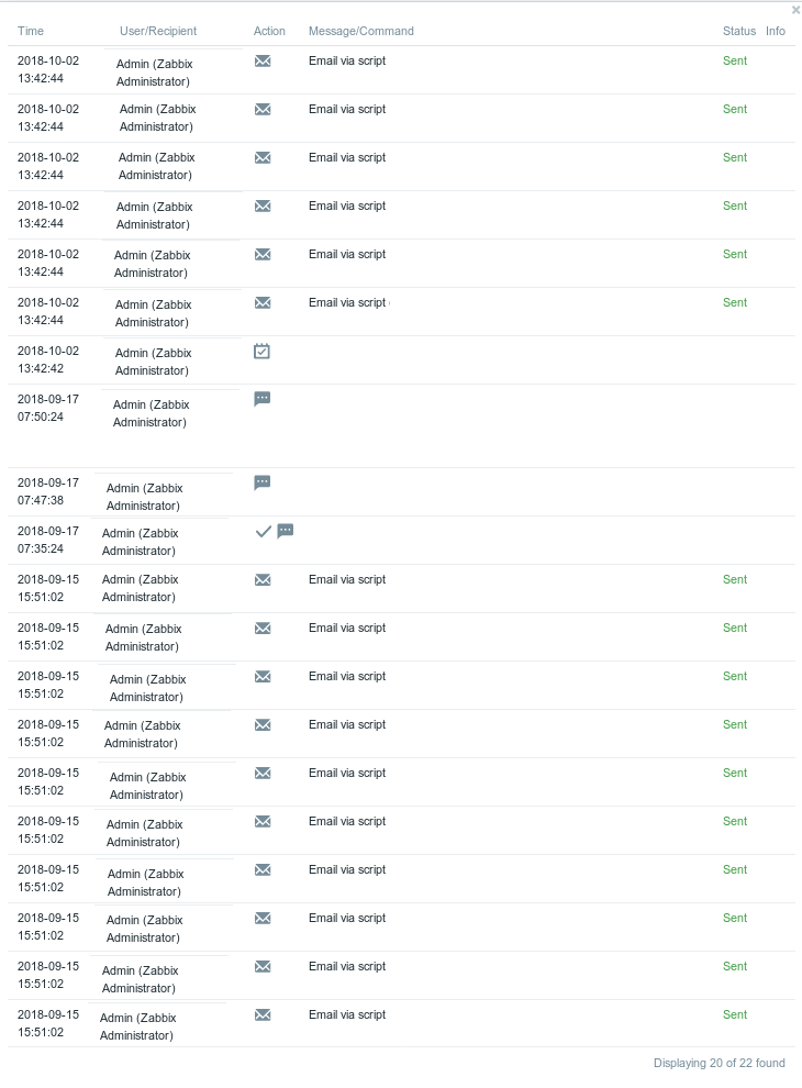
when someone opens those details by clicking on that "22", we can see a huge window like this:

Today with big screens and at least with FullHD resolution on most of them, a more responsive behaviour would be very useful.
For instance that 2nd screenshot "image-2018-10-02-14-23-18-581.png" with 22 detailed lines was taken on a FullHD 24" - fullscreen browser (Firefox on Linux, IE on Win8.1, doesn't matter which one), and it filled it entirely from the top to the bottom.
Why to wrap date & time?
Why to wrap login name + full name?
With that much details in that actions window, it should be behaving more dynamically. Perhaps kill that wrapping unless really required, or an configurable option to dynamically resize that actions window if necessary, in order to show as much informations as possible. Also paging if more than 20 might be useful. Maybe involve something of that new "COMAPACT VIEW", which is a perfect thing btw!.
In the browser it's being managed by the following:
<div class="overlay-dialogue" style="max-width: 800px">
Changing value 800px to min. eg. 1200px or more looks much better.

