-
Type:
New Feature Request
-
Resolution: Unresolved
-
Priority:
Trivial
-
None
-
Affects Version/s: 4.0.0
-
Component/s: Frontend (F)
Hi,
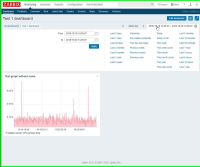
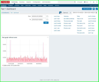
Is it possible to improve usability of graph while zooming back? For the moment it is a bit annoying, see screenshots with explanation below:
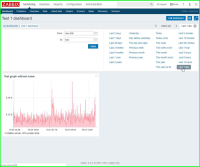
Step 1 - User clicks on "Last 1 day" selector
Step 2 - User moves mouse over "<" target and clicks once to go back 1 day
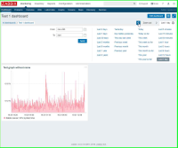
Step 3 - Rightmost "Last 1 day" tab automatically changes size to fit new start/end dates causing "< Zoom Out >" tab shift to the left. However mouse cursor remains at the same position and if user accidentally clicks once again the whole time selector collapse.
Step 4 - To go back 1 more day user needs to move mouse over new position of "<" target
Suggestions:
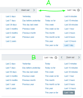
A. Fix width of time selection tab to accomodate any possible date/tame range
B. Swap positions of "time selection" and "Zoom out" tabs
Thanks
