-
Type:
Change Request
-
Resolution: Unresolved
-
Priority:
 Trivial
-
None
-
Affects Version/s: 5.2.0, 5.2.2rc1, 5.4.0alpha1
-
Component/s: Frontend (F)
-
Sprint 74 (Mar 2021), Sprint 75 (Apr 2021), Sprint 76 (May 2021), Sprint 77 (Jun 2021), Sprint 78 (Jul 2021), Sprint 79 (Aug 2021), Sprint 80 (Sep 2021), Sprint 81 (Oct 2021), Sprint 82 (Nov 2021), Sprint 83 (Dec 2021), Sprint 84 (Jan 2022), Sprint 85 (Feb 2022), Sprint 86 (Mar 2022), Sprint 87 (Apr 2022), Sprint 88 (May 2022), Sprint 89 (Jun 2022), Sprint 90 (Jul 2022), Sprint 91 (Aug 2022), Sprint 92 (Sep 2022), Sprint 93 (Oct 2022), Sprint 94 (Nov 2022), Sprint 95 (Dec 2022), Sprint 96 (Jan 2023), Sprint 97 (Feb 2023), Sprint 98 (Mar 2023), Sprint 99 (Apr 2023), Sprint 100 (May 2023), Sprint 101 (Jun 2023), Sprint 102 (Jul 2023), Sprint 103 (Aug 2023), Sprint 104 (Sep 2023), Sprint 105 (Oct 2023), S25-W34/35
Monitoring->Problems and Monitoring->hosts filters tabs, can be improved. Here are some suggestions:
1) Home tab icon changed to standard "Filter". Same as it looks, in version 5.0.
2) More space between saved filters tabs.
3) Arrows that switch tabs, should appear only when necessary.

4) When there is only Home tab, drop-down with filter list displayed at top of the page. I t should be displayed as usual drop-down.

5) Buttons name need to be changed.
6) With enabled "Show number of records" option, active filter should display result amount too. Not only when switch tabs.
7) Message should appear after deleting filter.
8) Long filter name. It would be nice to shorten it somehow.
9) Change arrows.
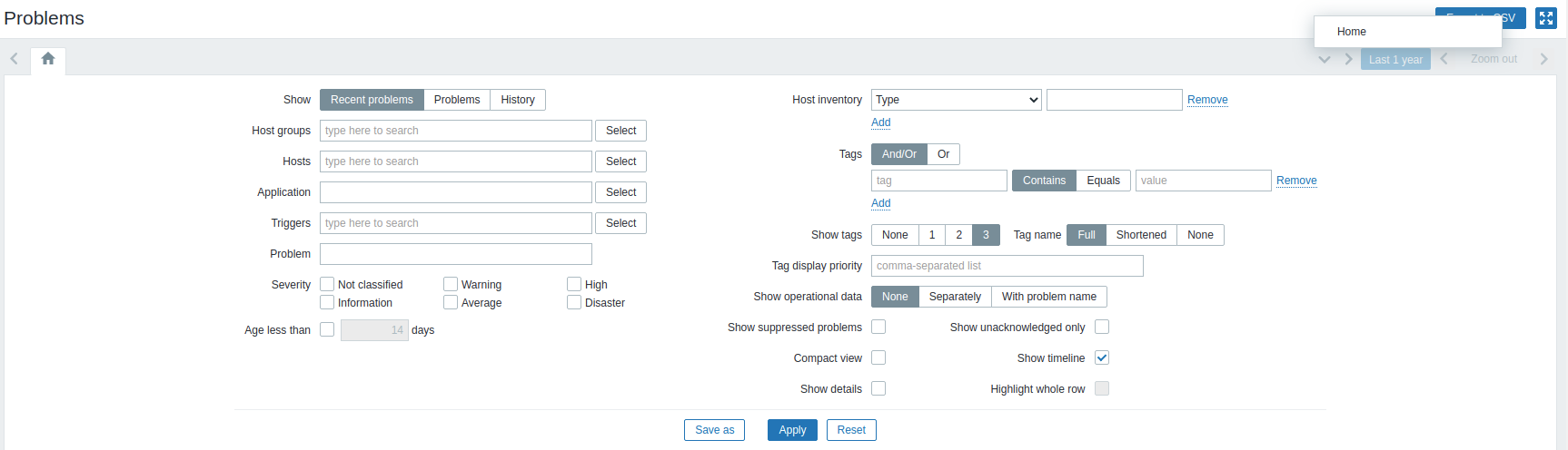
The arrows look different.
Here you can see that the arrows are blurry and not clear:
![]()
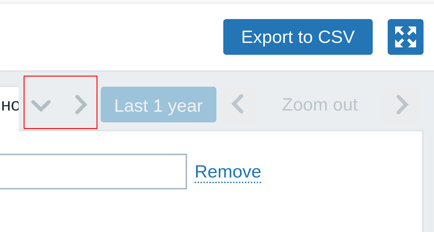
Arrows that used for navigation between filters look good and clear:
![]()
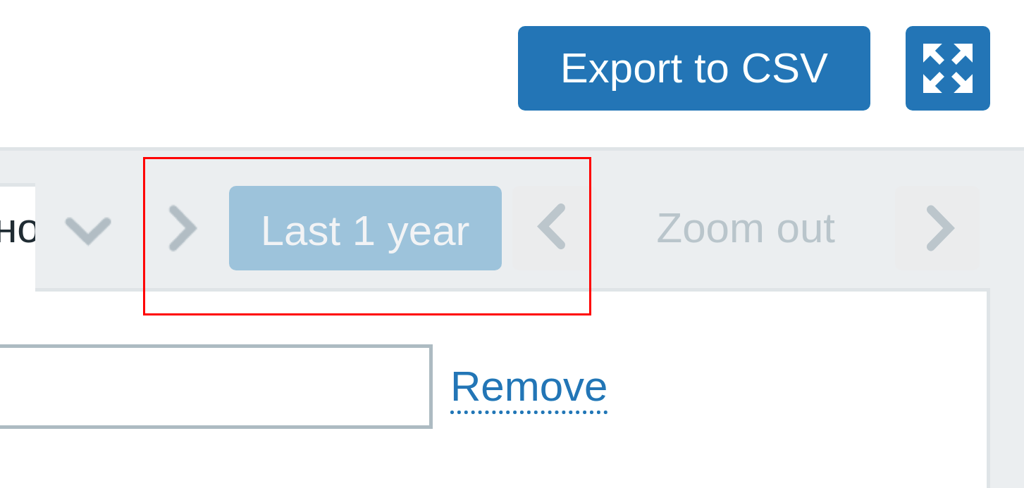
Arrows to the left and right of "Last 1 year" button are on a different levels:
![]()


- depends on
-
ZBXNEXT-6309 Add support for multi-page dashboards
-
- Closed
-

