-
Type:
Change Request
-
Resolution: Unresolved
-
Priority:
 Medium
-
None
-
Affects Version/s: 5.0.8, 5.4.0alpha2
-
Component/s: Frontend (F)
-
None
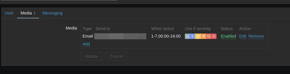
In the Zabbix server webinterface the worst UX was when I added something, for example a user media for mail notification, it showed up in the interface suggesting it was saved, so I navigated away continuing on other things but never received trigger mails.
Re-checked and the media entry for my user was gone, seemingly a bug, until I talked with a colleague which reminded my of the update button (which is just always there as enabled, so no visual hint suggests that it is required to press now).
This is IMO quite bad UX, no visual hint about pending changes suggest that its saved once there, and it makes it impossible to tell if there are updates pending to be saved and which they are. Honestly, I was a bit baffled to find such a grave UX issue in a major and long time existing project like Zabbix.
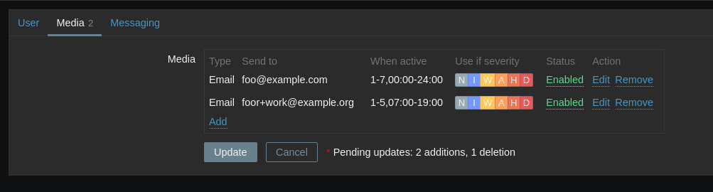
I have three suggestions:
- Disable the cancel and update button if they cannot possibly do anything, i.e., when there are no pending-changes active:

- Show more actively that pending-changes are there, and some hint about them. E.g.,
below a variant I tried and looks OK, IMO. It's just adding <span><i style="color: red">*</i> Pending updates: {x} additions, {y} deletion</span> after the two buttons:

- Optionally: rename "Update" to "Save", this seems more in line with what other GUIs do on such settings where a final "state save" is required. But not to hard feelings about that one.if 1. and 2. are implemented it'd be