-
Type:
Change Request
-
Resolution: Unresolved
-
Priority:
 Trivial
-
None
-
Affects Version/s: 5.2.6
-
Component/s: Frontend (F)
-
None
-
Environment:Debian vm
Hi all
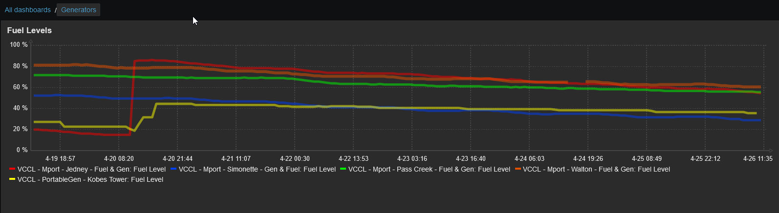
While the graphing in Dashboard works nicely, the legend can be hard to read when there a multiple items displayed. See attached screenshot for example. HostNames-ItemNames are often auto generated during discovery and can be cumbersome to display nicely.
It would be nice to have a label or nickname displayed in the legend that can be shorter/more suscinct than the item name, or more meaningful to a level 1 user.
And/Or
It would be nice if the legend could be listed in columns like an old fashioned html table.
Thanks guys.
Keep up the great work.