-
Type:
Change Request
-
Resolution: Unresolved
-
Priority:
 Low
Low
-
None
-
Affects Version/s: 6.4.9
-
Component/s: Frontend (F)
-
Environment:Centos 8 Stream
Zabbix 6.4.9 but has been the same on multiple previous versions
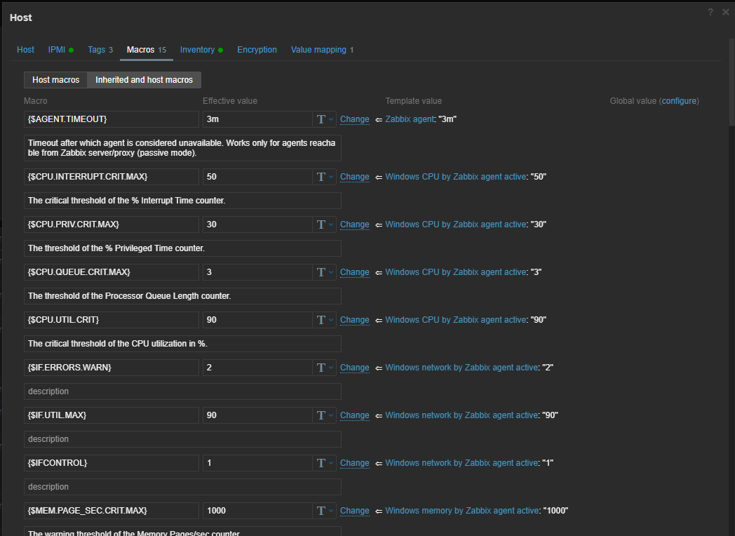
The Layout in the Host Macros Screen needs a better UI
It's very messy... A lot of our hosts have upwards of 50 macros which means a lot of scrolling. There could be an option to open this in a larger page instead of a pop out window and maybe there could be some filtering to allow you to filter the options down to the templated Macro that you are looking to change rather than having to scroll through them all