-
Type:
Change Request
-
Resolution: Unresolved
-
Priority:
 Minor
Minor
-
None
-
Affects Version/s: 7.0.4
-
Component/s: Frontend (F)
-
Environment:Debian 12
Current graph Axe options allow only:
- "Calculated", choosing "random" Axe ranges in each graph,
- "Fixed", forcing me to include unlikely values like -10V or risk line exitting graphs.
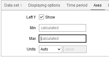
I see need for one of:
- "Flexible" option where graph uses fixed value, but expands if data needs it - can work like "Auto-expand" checkbox in UI. This way graphs stay consistent on dashboard in normal conditions, but individual graphs expand if their data need it.
- "Range" option where graph works like calculated, but then restricts value to set range - can work in UI by filling allowed range instead of one value.
Both these would allow dashboard Y-axes to be synchronized in normal situation but also allow graphs to show unusual values if they happen.
Complex alternative would be sharing calculated ranges between graphs on dashboard.
