-
Type:
Change Request
-
Resolution: Unresolved
-
Priority:
Trivial
-
None
-
Affects Version/s: 7.0.5
-
Component/s: Frontend (F)
-
Environment:RHEL based
Hi DevTeam,
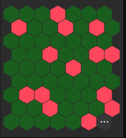
The Honeycomb widget is a valuable tool for highlighting "problems" across multiple hosts in a compact view. However, we've encountered a scaling issue when using it with a large number of hosts. The hexagons remain too large, making it difficult to effectively visualize all the data (see screenshot below).
Additionally, the "3 dots" icon currently lacks informative details when hovered over.
To enhance the widget's usability, I propose:
- Adjustable Hexagon Size: Implement a feature to allow users to customize the hexagon size, enabling better scaling for varying numbers of hosts within the widget's dimensions.
- Informative "3 Dots" Icon: Provide meaningful information or actions when the user hovers over or clicks on the "3 dots" icon. This could include additional details about the host, related issues, or relevant actions.
Thank you for your excellent work on the Honeycomb widget! We look forward to these improvements to further optimize its effectiveness.
