-
Type:
Change Request
-
Resolution: Unresolved
-
Priority:
 Medium
-
None
-
Affects Version/s: None
-
Component/s: None
-
None
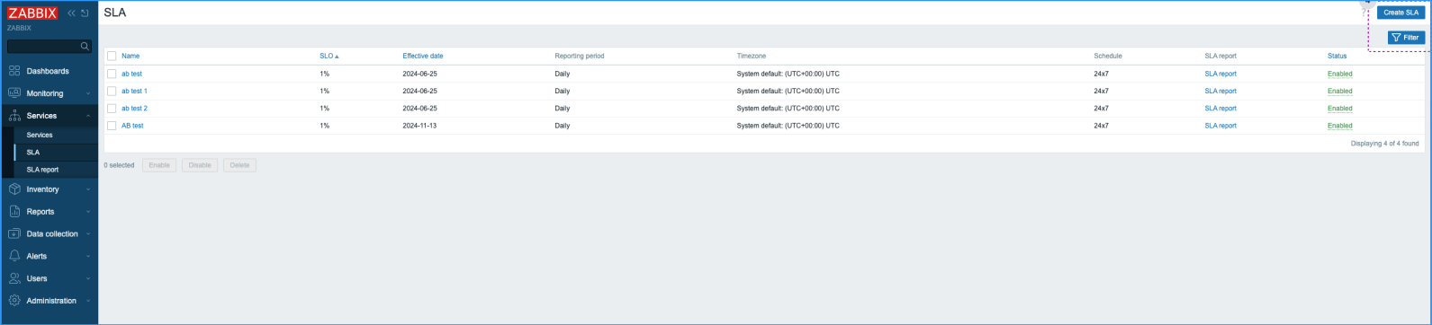
1. Monitoring Buttons
Steps to reproduce:
1. Open the Services/SLA
Description:
The buttons have identical color, which creates confusion and lacks proper hierarchy. This needs to be redesigned to make it clearer
Expected:
Buttons should differ in color or style to highlight more important.
The visual hierarchy should be clear, allowing users to intuitively understand which buttons take priority.

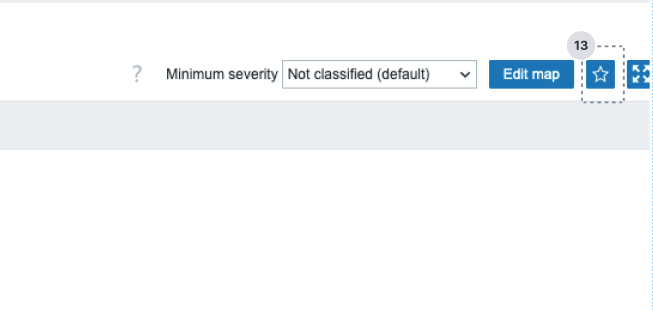
2. Monitoring Buttons
Steps to reproduce:
1. Open the Monitoring/Maps
Description:
For users its not clear what this button does since there is no feedback when users clicks it.
Expected:
The button should provide feedback. This will help users understand the result of their click and improve the overall experience.
**
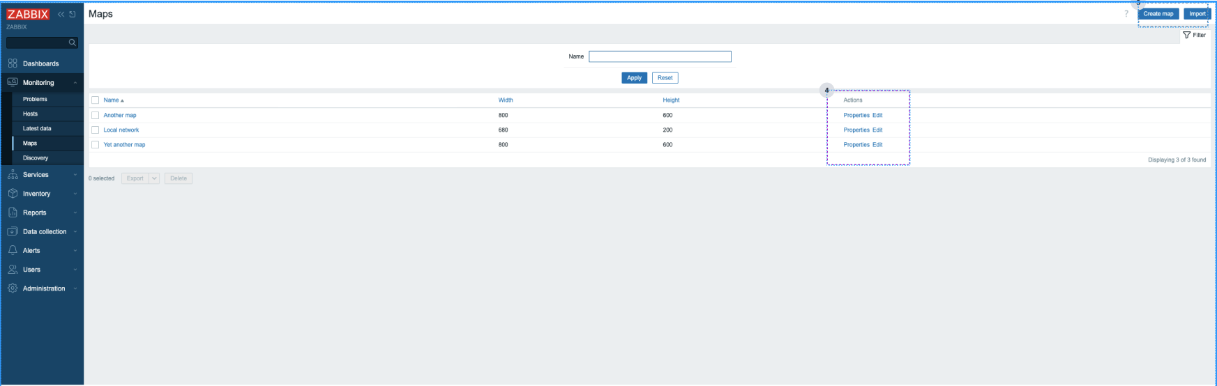
3. Monitoring Buttons
Steps to reproduce:
1. Open the Monitoring/Maps
Description:
The functionality of this buttons is unclear. Properties and Edit are very similar terms in UI, additionally this buttons look identical which creates confusion. Buttons should have descriptive labels and have visual hierarchy based on action priority.
Expected:
The buttons should have simple and descriptive labels and be visually distinctive based on action priority.