-
Type:
Change Request
-
Resolution: Unresolved
-
Priority:
 Major
Major
-
None
-
Affects Version/s: None
-
Component/s: None
-
None
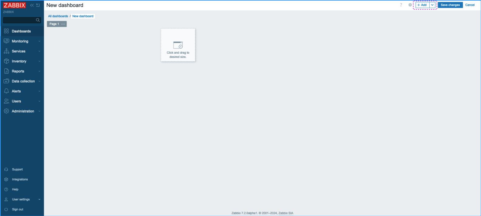
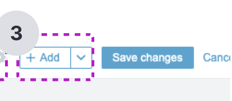
1. Dashboard Buttons
Steps to reproduce:
1. Open the Dashboard
2. Click Edit dashboard or Create a dashboard
Description:
What will be added if the user clicks this Add button? We need to create a proper label for this button which will explain its purpose to users.
Expected:
•The button has a clear and descriptive action label ex.: Add widget
•Users immediately understand the button’s purpose without needing to experiment.

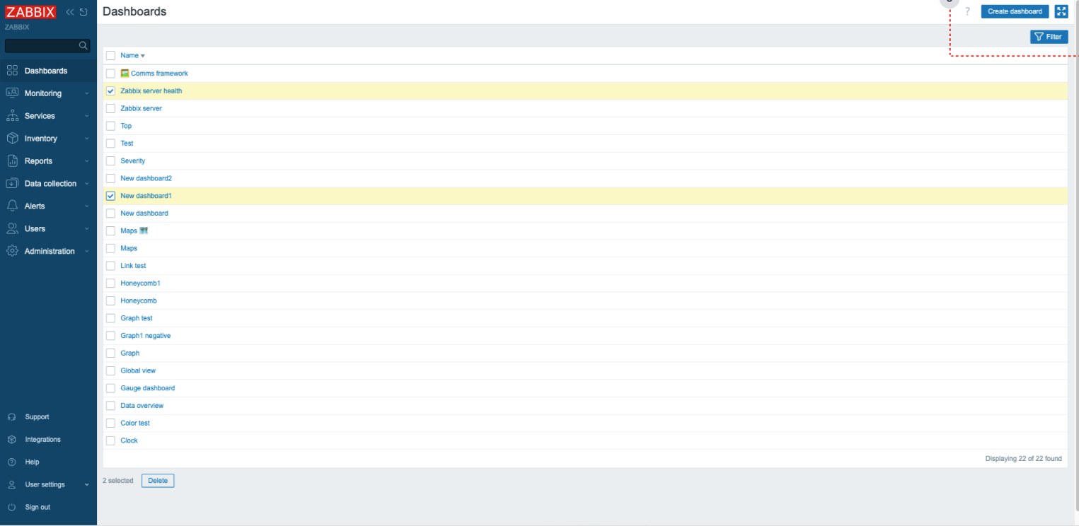
2. Dashboard Buttons
Steps to reproduce:
1. Open the Dashboard
Description:
The current interface lacks a clear visual hierarchy for buttons, making it difficult for users to distinguish between primary, secondary, and tertiary actions. This absence of button prioritization can lead to:
1. User confusion about which actions are most important or frequently used
2. Increased cognitive load as users must carefully read each button
3. Potential miss clicks on less important or potentially destructive actions
4. An overall less intuitive and less efficient user experience
Expected:
•Buttons should be visually prioritized to distinguish between primary, secondary, and tertiary actions.
•More prominent buttons should indicate important or frequently used actions.
•The design should reduce cognitive load and make the interface more intuitive and efficient.

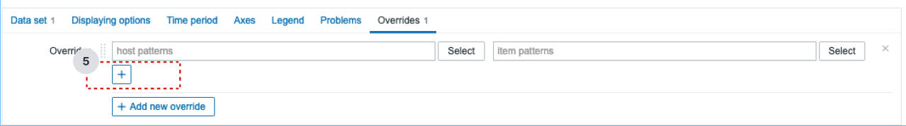
3. Dashboard Buttons
Steps to reproduce:
1. Open the widget editing page for "Graph."
2. Go to the Overrides page.
3. Click on "Add new override" - a button without a name will appear.
Description:
Button should have a descriptive label. This button is not used often throughout the interfaces user should have at least some idea about its functionality existing inside the config window. (Overrides) Visual feedback of applied actions also is missing, which complicates for users the process configuring visual changes of the graph. Also not clear where changes are applied and what they are changing.
Expected:
•The button has a descriptive label that explains its purpose ex. Select override type/ Override type
•Improving this functionality will significantly enhance the user experience.
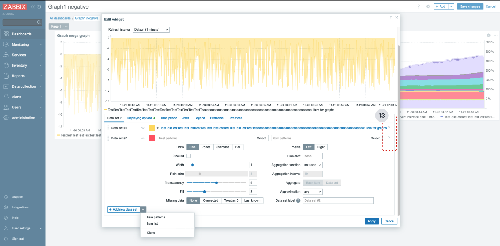
4. Dashboard Buttons
Steps to reproduce:
1. Open the widget editing page for "Graph."
2. In data set enter host long name
Description:
When data set with long name added delete buttons are pushed to the right and could not be accessed and users are not able to remove added data sets.
Expected:
•The layout should adjust to ensure that delete buttons remain accessible, regardless of the dataset name length.
•Consider truncating long dataset names with an ellipsis (…)
•The delete buttons should be visible and functional at all times, regardless of dataset name length.
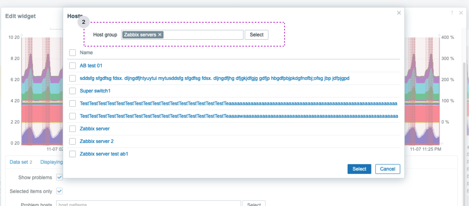
5. Dashboard Buttons
Steps to reproduce:
1. Open the widget editing page for "Graph."
2. Add hosts
Description:
Users should not be forced to press select two times to select desired items, there should be a way to simplify this user flow, but at the moment it feels broken.
When user presses action button user expects that asigned to button action will take place, at the moment if there is no value in Host groups, user needs press Select button two times.
Expected:
•Users should be able to select items the action with a single press of the action button.

6. Dashboard Buttons
Steps to reproduce:
1. Open the widget editing page for "Graph."
Description:
It is not clear for users that this button removes all items at once.
Expected:
•The button should have a clear label or visual cue to indicate that this action removes all items.
•Users should easily understand that this action will affect multiple items, reducing confusion and improving the user experience.

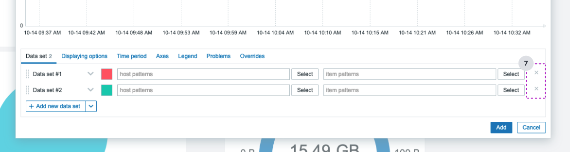
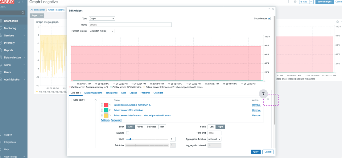
7. Dashboard Buttons
Steps to reproduce:
1. Open the widget editing page for "Graph."
Description:
This icon looks like a "close" button, not a delete option, additionally its very small and barely visible. We suggest to replace it with more distinctive icon which will better explain its purpose.
Expected:
•Replace the current icon with a trash can icon to clearly indicate the delete function.
•Users should immediately recognize the icon as related to deletion, improving clarity and the overall user experience.