-
Type:
New Feature Request
-
Resolution: Unresolved
-
Priority:
 Trivial
-
None
-
Affects Version/s: None
-
Component/s: None
-
None
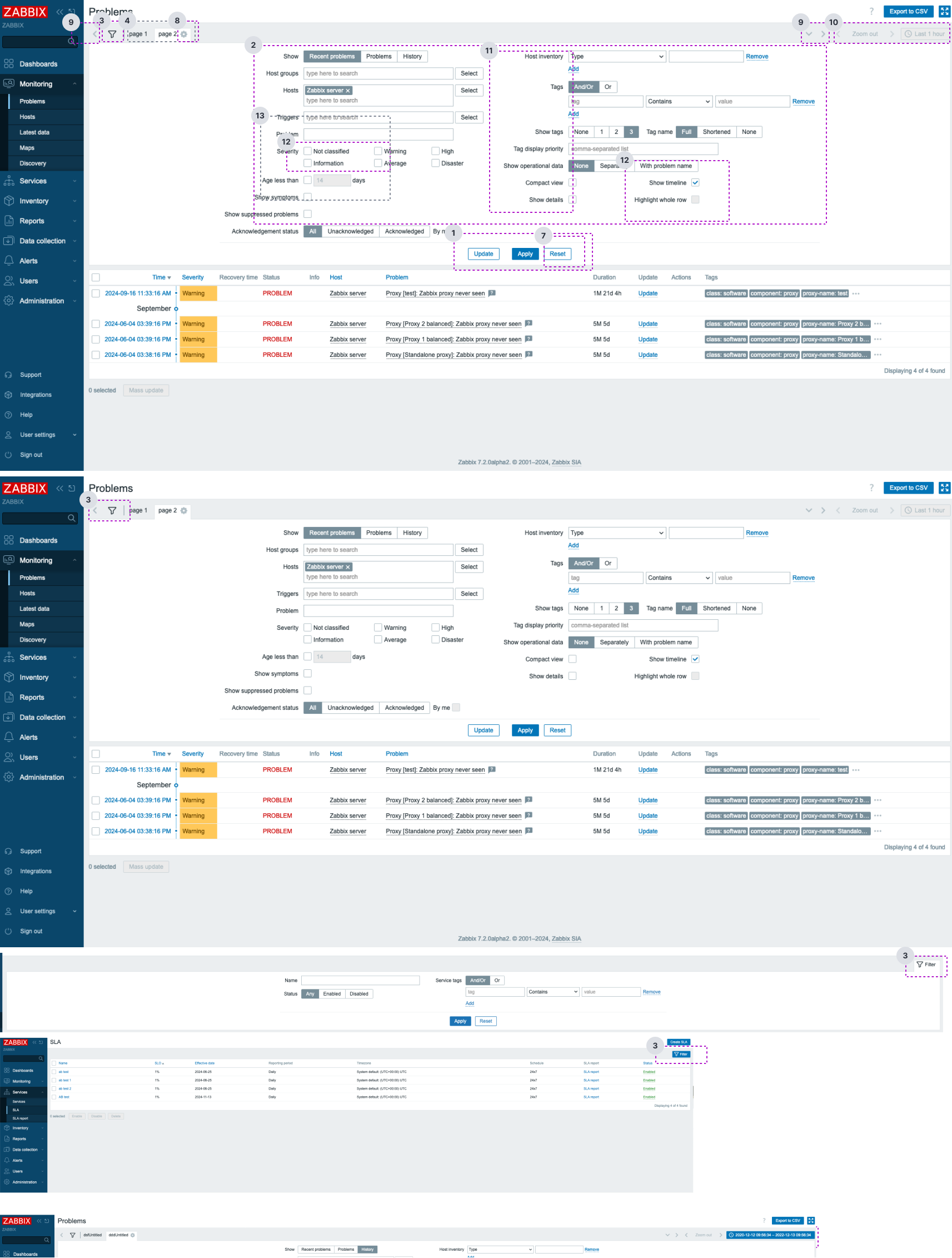
All identified UX/UI issues have been marked on the screenshot by related numbers:
Filter issues
1. Problem (1. on image)/high priority: When creating custom filters, the "Update" button appears for the created filters. However, next to the "Update" button also exists the "Apply" button, which semantically represents the same action. This creates confusion and makes it difficult for users to understand the purpose of each button.
Solution: The "Update" button should be renamed to something more meaningful and aligned with btn purposes, such as "Save changes".Insight: Users should not wonder whether different words, situations, or actions mean the same thing. We should define platform standards and follow industry conventions.
2. Problem (2. on image )/high priority: The filter interface looks overloaded with options, leading to cognitive overload for the user. The lack of hierarchy makes it hard for users to understand which actions or fields are primary. Inconsistent layout and poor alignment of the input fields and controls provide additional difficulties for users in understanding filter functionality.
Solution: The UX/UI team will provide improved design prototypes which will improve the ease of use and usability of Zabbix filter.
Insight: Interfaces should not contain information that is irrelevant or rarely needed. Every extra unit of information in an interface competes with the relevant units of information and diminishes their relative visibility.
3. Problem (3. on image)/medium priority: Filter trigger button does not have a consistent design and placement in the front end, in some sections filter button appears on the left in on the right, sometimes the filter button has a label, sometimes not. This creates inconsistency both in design and UI pattern and may seem for users like completely different functionality and confuse users.
Solution:
- To improve usability, filter icons should maintain a uniform design and placement throughout the application. This consistency helps users quickly recognize and understand the filter function across different screens.
- The UX/UI team will provide an improved design solution of the filter panel which will solve this inconsistent design and placement problems.
Insight: Users should not wonder whether different words, situations, or actions mean the same thing. We should define platform standards and follow industry conventions.
4. Problem (5. on image)/High priority: On many pages filter is expanded by default this prevents users from immediately accessing needed data and forces them to conduct additional unnecessary actions like closing the filter first, or scrolling down to access needed data and potentially distracting them.
Solution: We should make sure that in all sections filters are not expanded by default and do not prevent users from viewing their data. Users should decide on their own when they need this functionality to filter table data.
5. Problem (6. on image)/High priority: All three filter action buttons ("Save as," "Apply," and "Reset") have similar styling and improper positioning, making it difficult to identify which is the primary action and which actions are secondary. Affected sections: monitoring problems/hosts/latest, data collection, etc.
Additionally in monitoring > problems/latest data "Save as" button does not have a descriptive label.
Solution: The UX/UI team will provide an improved design solution for this problem. "Save as" button should be renamed to Save filter or something similar to convey the meaning of this button action.
Insights: Improving the distinction of action buttons in UI design is essential to creating a clear, intuitive user experience. Clear action button differentiation helps users quickly understand what actions they can take and reduces the cognitive load when interacting with the interface.
6. Problem (7. on image)/High priority: The "Reset" button is a destructive action and should be accompanied by a confirmation to prevent accidental resets of the filter, at the moment no Reset action confirmation message is available.
Solution: Destructive actions should be accompanied by confirmation modals in case the action was triggered by accident and prevent users from resetting the filter accidentally.
7. Problem (10. on image)/Medium priority: The functionality and purpose of "Zoom out" button is not clear, a proper label or explanation tooltip should be added for clarification describing this button functionality for users.
Additionally, when clicked the values of the button next to it change to date and time values without actually explaining what those values are and what they represent. At least an explanation tooltip should be added to explain to users what this data means.
Solution: A proper action-oriented descriptive label or the tooltip explaining the functionality of this button and related inputs should be added. This approach eliminates ambiguity and ensure that users can easily identify the button and related component functionality without guesswork.
8. Problem (11. on image)/High priority: Existing filter controls and input labels are not descriptive their purpose and functionality is not clear.
Solution: We should create a more clear and intuitive description for input forms and controls inside the filter. The goal is to streamline the user selection process by using language that is immediately understandable and aligned with user expectations and UI functionality.
Insights: By adopting user-friendly language and following established design conventions, we can simplify form interactions and reduce user confusion. The labels should guide users intuitively, making the selection process more efficient and reducing the mental effort required to understand and complete form inputs.
9. Problem (12/13. on image)/Medium priority: Filter checkbox labels and checkbox group labels look almost identical and are located very close to the checkbox component which creates a problem for users in identifying the real functionality of the checkbox.
Additionally, in some cases checkbox labels appear on both sides of this component. Component design and patterns should be consistent across whole UI to prevent mistakes, and confusion and speed up the learning curve.
Solution: The UX/UI team will provide an improved design solution and document checkbox component usage rules to solve and prevent this problem.
10. Problem/Medium priority: In sections where filters do not have lots of configuration inputs and controls it would be beneficial to organize filters in a one column layout for easier selections of needed filter settings, there is no need to use a two-column design here. Examples: discovery rules, event correlation, maintenance, SLA, etc.
Solution: If needed, UX/UI team will provide an improved design solution for this problem.
11. Problem (9 on image)/High priority: Controls for switching between created filters are active even when there no additional filters created and saved by the user, this pattern is misleading and could lead users to think that some of the functionality is broken.
Solution: These controls should be disabled or hidden until user creates and saves a few or more filters to switch between. Tooltip could be added to explain control functionality.
Subfilter issues
12. Problem/High priority: Latest data > Filter, when filter button is pressed to close the filter subfilter panel remains visible and there is no option to hide it. If there are lots of subfilters enabled this potentially could prevent users from viewing necessary table data and add additional unnecessary complexity to the user flow.
Solution: To be consistent across Zabbix front end, when user clicks the button to close filter, subfilter should be also be closed as it does in other sections. Ex. Data collection > Hosts > Items
13. Problem/Medium priority: The whole subfilter UI design can be improved, at the moment it is not clear that Subfilter is related and dependent on Filter. Subfilter designs is cluttered with options without clear structure.
Solution: The UX/UI team can provide improved subfilter design for implementation to improve UI and usability of subfilter. It would be beneficial if instead of link buttons (which has different functionality across front-end) we would create and use selectable tags to represent selected subfilter items.
14. Problem/High priority: Hosts > Items > Filter > Subfilter. At the moment each time when user clicks on desired subfilter item page automatically moves user to the top of the page which is not an expected behavior. This means that if user have a long list of Items each time when selecting a subfilter tag item user is automatically moved from list up to filter and each time user need to scroll back down and look for the needed item in the list this is very distrusting and annoying and should be prevented.
Solution: This should work the same way as in the Monitoring > Latest data > Filter > Subfilter. ** When user selects any tag in the subfilter the screen should not automatically jump up back to the filter, but should stay in place so the user could complete needed actions without being distraction and added complexity and necessity to move up and down between filter and Item list.
15. Problem: Filter components lack sufficient spacing between them; as a result, users have difficulties with filter usage and interactions.