-
Type:
Incident report
-
Resolution: Fixed
-
Priority:
Major
-
Affects Version/s: 3.0.0
-
Component/s: Frontend (F)
-
Environment:zabbix-3.0.1
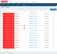
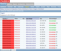
Most annoying problem with 3.x web-interface is big empty spaces around almost all elements on different pages (dashboard, triggers, ...). This is very uncomfortable for people with various screen sizes, from netbooks to wall-mounted flat panels.
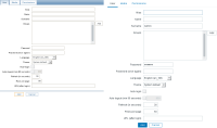
In zabbix-2.x, screen space usage was more effective (see attached screenshots). Please, fix this usability regression.
- is duplicated by
-
ZBX-10612 do not have an arbitrary minimum width
-
- Closed
-


