-
Type:
Problem report
-
Resolution: Fixed
-
Priority:
 Trivial
-
None
-
Affects Version/s: 5.4.9
-
Component/s: Frontend (F)
-
None
-
Environment:firefox 95
Steps to reproduce:
- Create a trapper number item
-
- Others work but this makes it easier
- In a dashboard
-
- Create a widget as a graph with:
- That metric as dataset
- Draw: Line
- Missing data: Connected
Aggregation function: None- [other graph options don't really matter here]
- Create a widget as a graph with:
- Submit very different values over time using zabbix_sender. Here's an example:
-
- At second 0: 0
- At second 5: 5000
- At second 60: 5000
- At second 65: 0
- At second 290: 0
- At second 300: 300
- At second 500: 300
- At second 510: 0
- See the graph at different time intervals
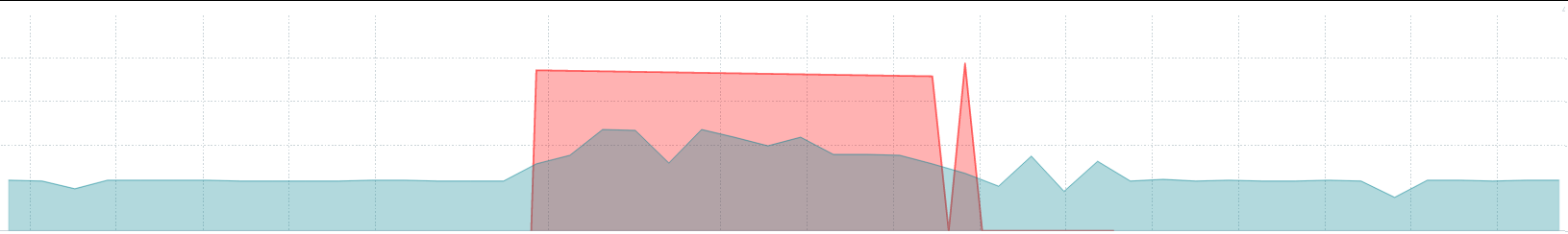
Result:
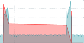
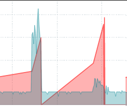
You see the graph overreaching all this time interval:

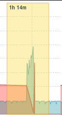
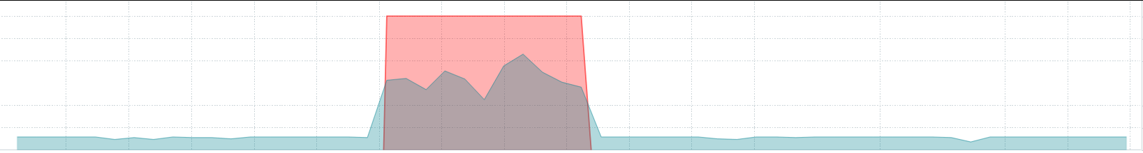
But if I zoom in into that interval:
Actually, only that tiny interval had red that high with a second spike:
If you think
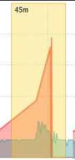
And if I zoom at the actual location:
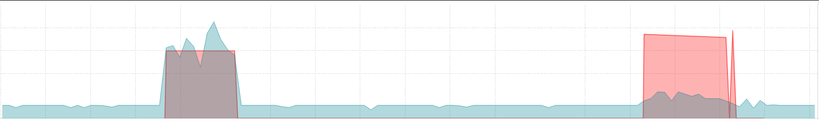
That is what I get.
So, the data is correct, it's the graph, when zoomed out, that is plotting incorrectly.
The graph was visually growing into a new value when actually there was a 0 value before the high value.
These graphs seem very "free-flowing" because they are measuring a very (metrics-wise) very chaotic but important system in our infrastructure that turns off periodically by design (I wish I could be more specific but NDA limits a lot what I can share)
Expected:
No aggregation to happen in the graphs and no disagreement between the zoomed out and zoomed in graphs when aggregation is set to "None".
I understand the space issues. When those exist, do not just choose the latest value for no aggregation. Instead, when drawing, it may make sense to push a value ever so slightly to the left so those visual bridges aren't visible.
Alternatives tried:
Different Draw option
- Points:
- They are too hard to see given our needs and their position
- Staircase:
- I initially thought of this one as ideal but it turns the "bridging" effect much more severe and even harder to spot.
- Bar:
- The bars are so thin I can't really look and analyze what I'm seeing.