-
Type:
Problem report
-
Resolution: Duplicate
-
Priority:
Trivial
-
None
-
Affects Version/s: 6.2.2rc1, 6.4.0alpha1
-
Component/s: Frontend (F)
-
Sprint 91 (Aug 2022), Sprint 92 (Sep 2022), Sprint 93 (Oct 2022), Sprint 94 (Nov 2022), Sprint 95 (Dec 2022), Sprint 96 (Jan 2023), Sprint 97 (Feb 2023), Sprint 98 (Mar 2023)
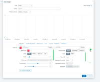
1. The data set multiselects layout in graph widget doesn't look good.
I suggest increasing the width of the multiselect to fit the right edge of the elements. The delete icon is too close to the right side, I recommended making the same padding/margin as in 6.0.
Before (6.0):

Now in 6.2 and master:

Suggest:

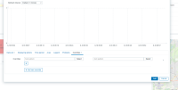
2. Same for overrides, I also suggest increasing the width of the multiselect and move the delete icon. After the delete icon there is now a large empty space.
Before (6.0), the position of the delete icon is almost the same as in the Data set:

Now in 6.2 and master:

Suggest:

3. Missing drag and drop option for overrides
- caused by
-
ZBXNEXT-6940 Vector graph widget improvements
-
- Closed
-

