-
Type:
Problem report
-
Resolution: Fixed
-
Priority:
Trivial
-
Affects Version/s: 6.0.34rc1, 7.0.4rc1, 7.2.0alpha1
-
Component/s: Frontend (F)
-
S24-W44/45, S24-W46/47, S24-W50/51/52/1
-
0.125
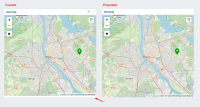
The Geomap widget has a small padding applied, but to me seems that it serves no purpose. A bit of visual "clutter". I propose cleaning it up and maximising the space the map takes up in the widget:

Also seems like it should not be part of the visual design, since other widgets don't have this. Pictured - the default widgets take up all space:

