A better name for the "Data collection" menu section

XMLWordPrintable

    • Type: Change Request
    • Resolution: Unresolved
    • Priority: Trivial
    • None
    • Affects Version/s: 7.0.22, 7.4.6
    • Component/s: Frontend (F)

      More than three years have passed since the Zabbix menu redesign (ZBXNEXT-7830), and it might be time to evaluate the results.

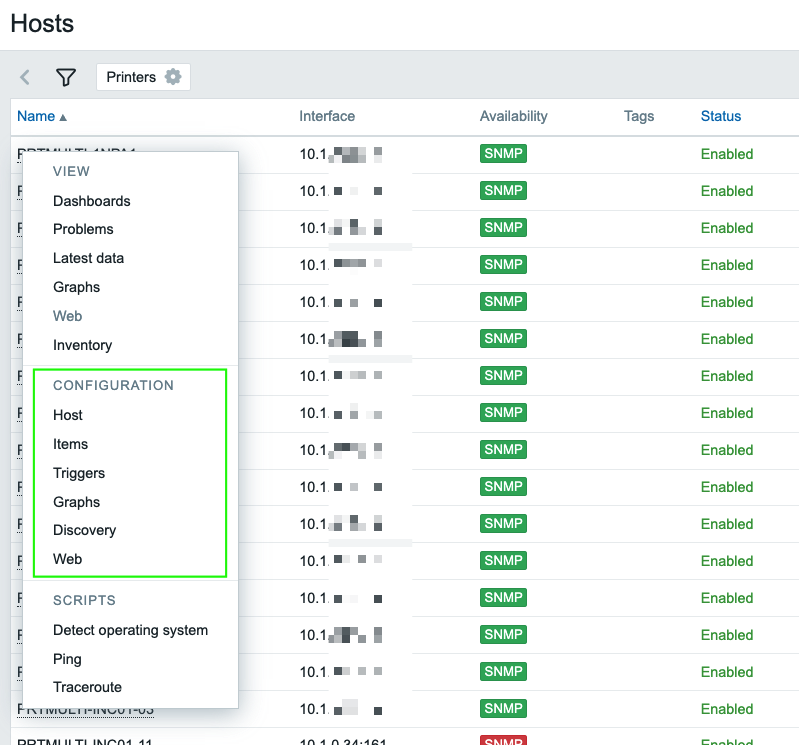
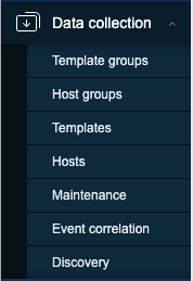
      I'd like to start with a question already raised: the choice of the name "Data Collection" for the Configuration section. Was it a good choice? Of course, every choice is a compromise, but was this one a good compromise?

      In my experience, new or occasional users find this name confusing and difficult to interpret. Even if you get used to it over time and memorize this quirk, navigating the menu remains very counterintuitive. There are other reasons why this choice should be reconsidered, and I'll try to list them in the comments below.

        1. screen0895.png
          screen0895.png
          79 kB
        2. screen0896.png
          screen0896.png
          67 kB
        3. screen0897.png
          screen0897.png
          119 kB
        4. screen0898.png
          screen0898.png
          59 kB
        5. screen0898-1.png
          screen0898-1.png
          59 kB
        6. screen0900.png
          screen0900.png
          13 kB
        7. screen0901.jpg
          screen0901.jpg
          120 kB

            Assignee:
            Valdis Murzins
            Reporter:
            Nicola Mauri
            Votes:
            1 Vote for this issue
            Watchers:
            2 Start watching this issue

              Created:
              Updated: