-
Type:
New Feature Request
-
Resolution: Fixed
-
Priority:
 Trivial
-
Affects Version/s: None
-
Component/s: Frontend (F)
-
Prev.Sprint, S26-W24/25, S26-W26/27, S26-W28/29, S26-W30/31, S26-W32/33, S26-W34/35, S26-W36/37
-
6
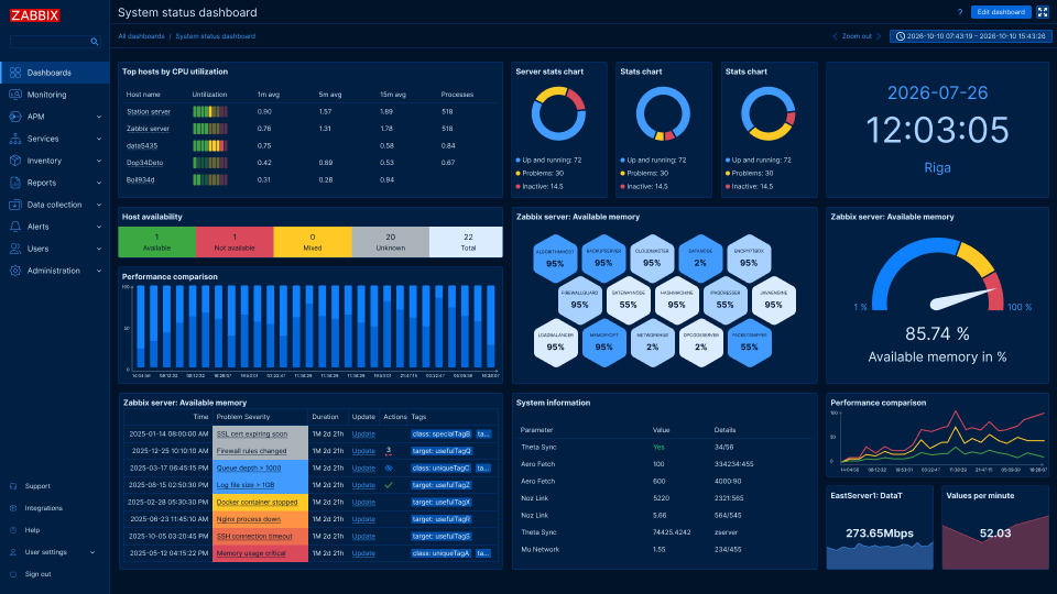
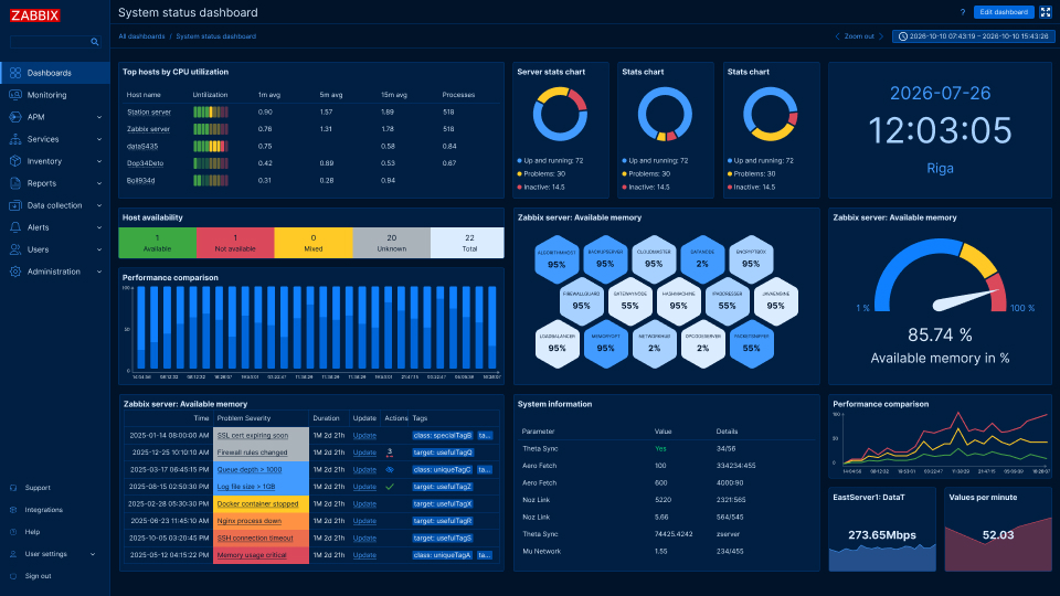
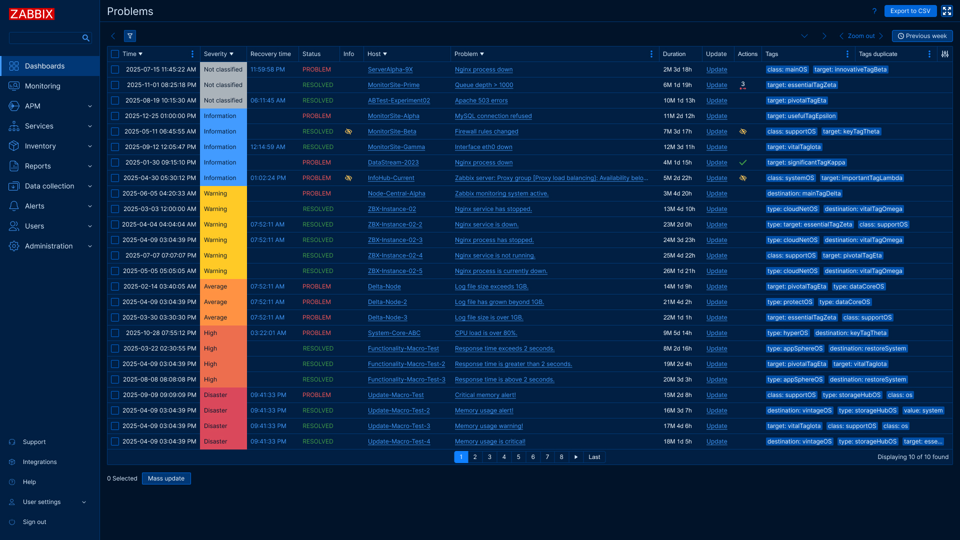
Adding a dark blue theme would bring a cool and fresh look to the UI.
Requirements:
1. All colors should pass the minimum WCAG accessibility requirements:
- Body text min. contrast ratio 4:5
- Active user interface components and graphical objects such as icons and graphs 3:1
- Pay closer attention to component read-only/disabled state colors.
2. No gradients, transparent colors should be used sparingly and only if needed. (E.g.: Modal scrim, shadows)
3. Keep semantic colors as close as possible to the Blue/Dark theme's original colors
Designs will be provided by UX/UI team