-
Type:
Change Request
-
Resolution: Fixed
-
Priority:
Minor
-
Affects Version/s: None
-
Component/s: Frontend (F)
-
S25-W36/37, S25-W38/39, S25-W40/41, S25-W42/43, S25-W44/45, S25-W46/47, S25-W48/49, S25-W50/51/52/01, S26-W04/05, S26-W06/07, S26-W08/09
-
8
Please elaborate the following small improvements to 4.0 Graph widget:
- It will be nice if the tooltip is sorted by value by default (from highest to lowest):
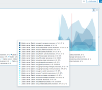
- Second proposed color is not the best looking maybe?

- Since it is possible to hide X-axis, it would be nice to provide timestamp in the tooltip too, not only values. Otherwise, the graph is useless without axes.
- There should be another automatic color chooser. Where color is chosen to be more distinct from the first one. As it turns out it's really hard to see which what on the graph. Current color algo should stay as an option.
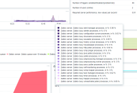
- One of the reasons to hide X-Axis and the legend is to make graph more taller. Why so much whitespace is present under the graph?

- When I zoom in with some range selected, how do I actually go back? I don't see any 'back' button. Zoom out - doesn't bring me to the range I was before.
- caused by
-
ZBXNEXT-4588 New Graph Widget
-
- Closed
-
- is duplicated by
-
ZBXNEXT-9808 Order of the labels when dragging over the graph
-
- Closed
-
-
ZBXNEXT-8321 Ability to sort metrics in graph widget popup
-
- Closed
-
-
ZBXNEXT-9396 Raise default ZBX_WIDGET_ROWS from 20
-
- Closed
-
(2 mentioned in)


